Description:
This one
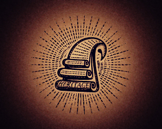
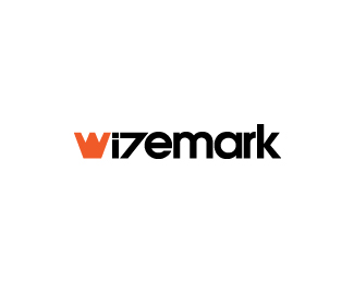
got rejected unfortunately, so i had to do another owl (excuse me for that, i really love them), the idea i had while was working on the initial design. Would be a graduate hat on top of it too much?
As seen on:
www.wizemark.com
Status:
Unused proposal
Viewed:
13897
Share:

Lets Discuss
Awesome! Or should I say owlsome? :)
ReplyAha that would explain your username wize one. Sweet.
Replywow! much better than... that one.
ReplyWitty comments, both. Thanks, guys :)
ReplyHey, Dovla.. thanks.. ye.. way dif execution.. :)
Replythis is it Srdjan!
ReplyWow, this is great. I really love the style on this one. Good work!
ReplyThanks a lot Andrei %26 Marvin.
ReplyWas this done in MS Paint?
ReplyThat%60s a better comment, Jose. :p Thanks, dude. %3B)
Reply%5EHah good :) This is killer man, fine piece of work as per usual Srdjan. Cheers!
Replythis stlye is so cool. love it. you da man, Srdjan.
ReplyThanks, J :) %26 Mike. :)
ReplyI was drawn to this immediately. Took me a while to see the owl after reading your comments, so think this has a lot of depth and will keep the viewer interested and looking into this.
ReplyYou're unnecessarily good. Sure the owl was killer too.
ReplyThis one is awesome!!
ReplyDamn. Awesome stuff indeed!
Replyyou are too good for us mortals
Reply*Wow, man, this mark is nuts!
ReplyThis is great stuff. It can work for the luminaties too :D. JK . Good job!
ReplyThanks for the positive comments all.
ReplyBeen knocking out some killer stuff. Keep it up. Impressive!
Replypure excellent.
ReplyThis sure is impressive, Srdjan. Keep em coming.
ReplyThank you, guys. Really appreciate it!
ReplyBe curious to know what the Company represents. reason I say that is because I also see the owl wearing one of those old Judicial System type wigs.?
ReplyHah.. was wonder will anyone see it. :) It wasn%60t the main idea, but i thought it%60s a nice additional detail. Now, since this isn%60t for a real company (just an idea i had while i was working on the original design that got rejected) i do you agree that it can work here?
Replyactually I saw the Hair/scrolls first had to look for the owl.
ReplyI can live with that. :)
ReplyBarn owl right?
ReplyYe, the weirdest one.
ReplyGreat job (I just knew it's your work)
ReplyWow, I didn't even recognize that it was an owl until you said so, but now I can't not see the owl. Nice mark, very scholarly and energetic!
Replylaborious work!
Replywow !
ReplyThanks, guys.. appreciate it!
ReplyAnother great logo! Love it!
ReplyPlease login/signup to make a comment, registration is easy