Creation
by Wizemark • Uploaded: Jun. 02 '10 - Gallerized: Jun. '10

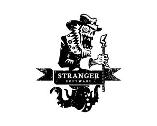
Float
(Floaters:
151 )
Description:
Rest of the project that just ended up unhappy. What`s soothing is that concepts were not the reason.
update: found its home and in use now.
As seen on:
www.wizemark.com
Status:
Client work
Viewed:
25095
Share:

Lets Discuss
very nice mark!
Replyand i like stilization too :)
Replynice style..
ReplyVery cool my man! Very cool!
ReplyFantastic and fantastic!
Replylove the style, again. really admire your work, man. nice.
ReplyJust Awesome!!
ReplyBig, Saurabh, Michael, Roko, Mikey and Alan - Thanks a lot, guys!
ReplyThis is great looking Srdjan! Btw, how's Three65 going?
ReplyI find it difficult to get excited about logos involving pencils because there are so many of them, but this one is intriguing.
ReplyCheers, Joe! re 365 - I think I'm done, the pig's got my gun.. :) No really, i think i%60m def done. It was exciting and fun.. for some period, after that it started to become quite annoying and it was a really huge commitment and weight with coming up every day with something that makes sense while still being original, interesting and fun. It was messing up a lot with my regular projects, life and basically everything. However, i%60ve learned a couple of things about myself and confirmed some i knew already.. %3B)*@Jerron I appreciate your comment, man!
Replywow, this is really great
ReplyGreat stuff, Srdjan!
ReplyGreat!
ReplyThis reminds me of the film 'Contact'. Nice one Srdjan.
Replydaaamn. this is nice.
ReplyWow...crazy good. Great background too!
Replyyour one of the best wize. Interesting to hear about 365. Keep up the great work
ReplyThis is great...love it
ReplyBeautiful mark!
ReplyThis is so sweet my friend.
Replygreat mark
ReplyThis is top notch
ReplyVery cool.
ReplyThis is popping OFF!
ReplyVery cool!
ReplyInteresting... very interesting. And cool!*%3B-)
ReplyLove it! Pretty Darn Sweet.
ReplyAwesome! Great job : )
ReplyCheers, guys! You%60re all too kind.. :)*
ReplyKeep coming back to this one! Great work!
Replyjust perfect mark!*oftenly, clients reject the best...*(thus harm themselves) and break the designers' hearts %3B)
ReplyафигетDC CAрутCE
Replycool mark:)
Replyvery very cool
ReplyLet me be the first one to congratulate you! Well deserved Srdjan! Samo naprijed kolega:)
ReplyYes, glad to see you on the front page. Well deserved indeed. Congrats!
Reply@Roko %26 Kevin Thank you, guys!! :)
Replyreally nice!
ReplyGood stuff Wize..lizard ... I mean mark :)
ReplyGreat thought
Replycheers, ppl!
ReplyI don't care too much for tattoos, but this one would look awesome on my arm:)
Replylol! Thanks, bro! This one found its home few days ago, btw. Will update it as soon as it%60s finished.
Replyawesome awesome!! looks great in b%26w compared to the color, although that one is nice too! bravo
Replygreat piece !
ReplyI%60m speechless! :))) Super!
Replycool mark
ReplyLove this mark. Looks like you captured the feel of an ancient civilization. Really cool!
ReplyGreat Work.....
ReplyPlease login/signup to make a comment, registration is easy