Description:
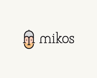
Logo design made for my new friend, Mike Carter, who is a freelance developer. He asked me to design a personal logo that represents 3 key values: trust, reliability and agility. If you like to know/see my thoughts that went into this design you can have a look by clicking the url below. Btw, both his initials are integrated in the character, in case you didn't spot them right away.
As seen on:
http://bit.ly/dafWPc
Status:
Nothing set
Viewed:
10564
Share:

Lets Discuss
Love the simplicity. Great work!
ReplyCool type! love it.
Replythis i rather neat!
ReplyJust perfect!
Replywonderful work, love the colors and the whole layout:)
ReplyLove your conceptual thinking here. Just a thought though, do you really need all those lines in your presentation? Maybe just the meanline and baseline? Just my opinion. Nice work.
Replycool graphic
Replythnx a ton everyone! Actually Mike, I'm not surprised to hear that from you :) It's the part I already planned to redo in my presentation, so I completely agree with you. Btw, I'd like to give credit to @Bitencourt for letting me copy the color circles :) Really like those myself %5E%5E Thanks again everyone for the response
ReplyDo it like this: http://logopond.com/gallery/detail/117369
ReplyJep that was my plan :) something similar to that. Btw, which one do you think is the easiest to use for such sort of design, illustrator or photoshop?
ReplyRoy, what relation is that link?
ReplyCool - love it.
ReplyReally awesome work, Tomme :)
ReplyClever logomark. and why not - do the lines presentation - I know it can be fun sometimes!
ReplySuper! Very nice!
ReplyGood Call Anthony, I agree all the letters are lowercase except the I. I would recommend knocking off the right side serif and dotting the i. That would be perfect IMO.
ReplyWill definitely try that, because Mike asked for a couple of type variations. Thnx for the tip Anthony and Mike.
Replyvery nice logo work
ReplyGreat mark!
ReplyLove the simplistic style. Nice logo.
ReplyI've updated the type, thanks again for the tip Anthony and Mike.
ReplyWell done, Tomme! :)
ReplyLovely fella Thomas.
ReplyVery conceptual logo, Tomme! :)
ReplyYep, I think that did it :) only thing that was bugging me. Kudos!
Replygracias mis amigos :)
Replyloving it!
ReplyAgree with rest, great stuff!
ReplyPlease login/signup to make a comment, registration is easy