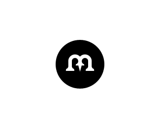
Description:
Hooray! I finally came up with a brandmark I want to keep for myself. Why finally? Well... about one year ago I wanted to start promoting my logo design skills to the world. So I figured out, I needed some sort of brand name, and after trying 2 to 3 different names, I made a pact with myself and agreed to go with Made By Thomas.
One year later I finally figured out how I want to promote myself, and here's the result in it's most purest formation. I was always taught that the best and most timeless logos are the ones that work flawlessly in plain black and white. So I decided I wanted something simple, solid, memorable, unique, powerful and timeless. That's why I came up with my own monogram, and I even had the luck to put some negative space init aswell :) At the moment I am madly in love with it and I just want to treasure it for the rest of my future career as a brand identity designer. I really plan to do some wonderful things with it, starting with an unfortunately rather expensive corporate stationary and a fresh new webdesign.
So that's the story of my name, how about my new logo? Well, here's a small checklist for you, see if you can see what I see? (
As seen on:
http://www.madebythomas.com
Status:
Client work
Viewed:
9800
Share:

Lets Discuss
My head hurts from reading all that :P Congrats on the new identity Thomas.
ReplyI like it. Are you still going to use the red you had on the previous version with the lightening bolt?
ReplyJep, that's the plan! and I know what you are talking about Joe, my head is also hurting from typing it :P*
ReplyHey Thomas, good that you're finally satisfied in 101%25 I hope, though the one with the lightning bolt is still pretty cool for me too :))
Replyany type?
Replypretty cool, i can't read the whole thing though :)
ReplyCongrats Thomas, pretty interesting solution.
ReplyYou see? Without my comment you wouldn't get to this bad boy:) Congrats buddy, I'm glad you're satisfied with it.*P.S*That's gotta be the longest logo description here on Pond:)*
ReplyOh dude...please break done that text into bite size pieces in the future. Now I'm going to need a lie down....
Reply@milou: it was, but i prefer this one nonetheless :)*@brandclay: I bought the 'Rooney' type to use as my primary font for my upcoming stationary.*@dsauna: What part can't you read? If it's the part where I say you can see me sitting across my client.. have a look at the negative space inside the mark.*@ru_ferret: merci :)*@Rokac: True remark and also true about the text. I wrote it since for me, this is actually my 'launch', rather than a year ago %3B)*@fabian: :) I know it sux this way, and I tried to break it into diff paragraphs, but for some weird reason LP doesn't allow it..**Really appreciate the feedback everyone, thnx again.
ReplyRemarkable... is all I can say.%0D*%0D*Having read the text, one can really notice your happiness and enthusiasm mr. MBT. M - clearly seen, B - of course as well, T - I figure you had to go for a less legible version of it due to the image in the negative space.%0D*%0D*I think that just like you said it yourself, the two fellas sitting at the table are and will become something like a mark within the mark, making it immediately recognized, even if the T could be hard to notice.%0D*%0D*But I'm just bitchin' about the T, thus here I leave it alone and allow me to repeat myself - R E M A R K A B L E .
ReplyThomas/Tomme, however you choose to talk about this, if you love it, that's half the battle. I can't even begin to tell you how long it took to come up with my own new, actual identity. Which will probably be a cold day in hell before I post here...due to the unfortunately high rate of logotheft here. Regardless......if you truly love your own identity, protect it. Look into ways to copyright it, and be able to sue the hell out of people if ever the need be. Congratulations: this is a great mark.
ReplyThanks guys, appreciate the useful feedback :)
ReplyI think this is one of the best (or maybe even the best, cuz I cannot remember a better one) logos, I've ever seen...**the M-B-T is brilliant, I didn't saw the T on first sight, very clever**monograms are my favorite logos, that's why my own logo is a monogram too, I can learn a lot from you :)
ReplyThanks so much Daniel :) It's always a tremendous pleasure to read comments like yours.
Replythis must be the longest description i've read over pond! :)) nice job man! good luck under the new name and identity! :)
ReplyThanks a lot tass-man %3B) very much appreciated
ReplyTo create your own brand - it is always a big challenge for a designer. ceirtanly this is a memorable brandmark. I saw the pin right away, the only thing I didn't realize before I read the description is the one in negative space, but after reading it makes sense to me. it looks really good in b%26w try to design your site in the same manner with slight color accents here and there, and yes I think you should use some other font with this one on your site, something really simple as Arial or Helvetica perhaps. Congrats.
Reply%5EArial? Nooooo! :-)
Replyhahah ok however something simpler than the type tomme has right now on his site...%3B)
Reply@Andrej*:)
ReplyI've spent 200%24 on a new font that I plan to use once I start designing my stationary and new webdesign, so you'd better like it :P
ReplyGreat work, Thomas. I really enjoyed your writeup, and love the brandmark!
ReplyGreat stuff buddy! Congrats :)
ReplyGreat result, u can be proud!
Replywhat jan said.
Replythnx guys, appreciate the floats and comments
ReplyStill loving this simple yet brilliant mark Thomas!*Excellent work. After a lot of years I still need to create a good one for myself :)
Replyhehe thanks a lot cresk! Good luck with making yours %3B-)
Replylove it.... feel free to give me any advice on my work...lol
ReplyThnx :) just be yourself and be creative %3B)
Replycheers Jonas :)
Replyman , this is really great !
ReplyPlease login/signup to make a comment, registration is easy