Float
(Floaters:
68 )
Description:
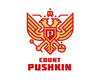
Symbol for a vodka brand.
Status:
Unused proposal
Viewed:
11216
Share:

Lets Discuss
Really nice. I keep expecting to see a swastika on the shield though... Other than than, it's great.
ReplyThanks. It's a stylization of the Russian coat-of-arms: http://en.wikipedia.org/wiki/Coat_of_arms_of_Russia - but the 'double-headed eagle' has been used by various nations, most prominently by the Roman Empire - http://en.wikipedia.org/wiki/Double-headed_eagle
ReplyThis looks fantastic!
ReplyThanks Rokac.
ReplyChinese style, nicely done, interesting colors too.
ReplySimply awesome.
ReplyThanks Pierro %26 Sean. Glad you like it! :-)
ReplyAwesome work!
Replynice*but why eagle for a %22count Pushkin%22? *That Pushkin meant? poet?
Replyit should be good vodka:) nice logo Simon:)
ReplyWell done simon. I love the symbolism going on.
Replydon't knew that Pushkin was count... shame to me
Replyhe was't count ))*it must be another Pushkin... )
ReplyDigging the style, very cool!
ReplyGreat style! Love this logo!
Replywonderful !
ReplyCongrats on the gallery spot! Like this one a lot.
ReplyThanks everyone for your kind comments! :-)
ReplyVery paradoxical association in perception. It was not right to do perverting heraldry.
Reply%5E 47 people disagree that I'm a pervert. %3B-)
ReplySimon says? Mas Vodka - beautiful work!
ReplyI don't wanna say that you a pervert %3B-) *Just the Emblem of the Russian Federation looks like german's simvol, from the times of Second world war. Blood-red color refers to the era of the Soviet Union. There was no graphs in Russia at that times.**%3B)
ReplyI need vodka its friday night!!! So feel of vodka and russian!!!
Replyjust awesome!
ReplyVery nice, Simon! i recently did a similar style logo for a client. Check it: http://logopond.com/gallery/detail/144071
ReplyYou Too Simon. Would like to see you Featured here. Incredible works!
Reply^ I agree, great stuff.
ReplyTide Brand!
ReplyPlease login/signup to make a comment, registration is easy