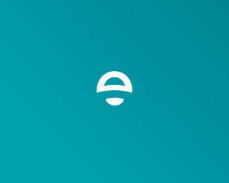
Ethereal
by SeanHeisler • Uploaded: Feb. 15 '10

Float
(Floaters:
49 )
Description:
My old personal identity.
As seen on:
Sean Heisler
Status:
Client work
Viewed:
7840
Share:


Lets Discuss
Hi Ethereal...**Like the mark but I'm not gone on the type. But the mark is so appropriate, when i look at it, tis like seeing Earth from the moon, and since ethereal dictionary definition is otherworldly visions, I think its bang on the money.**Sorry about the type, I thinks its to weak, I would look at up weighing to see would that make a difference? but thats just my opinion, regardless I think you have something special here. Well done, ones own identity can make or break ya, mentally and physically!**
Reply%5E Thanks! Here's the deal with the type. The definition of Ethereal is %22light, refined, airy, celestial, heavenly...%22 and so the type weight reflects this, that's why the light face. %22Light and airy%22 is the key there. Also, my bent toward Swiss influenced styles from my education is a nod to Helvetica, a typeface I hold is high regard. Thanks again for your comment, I really appreciate it, and glad you like it!
Replyhey ethereal...congrats man...all da best **I know you are xcited about this identity...my only problem is (maybe its jus me)..the the type has feminine features, or look, or whatever u wana call it, were as ur mark is not jelling wid the type, ur mark alone stands very powerfully...maybe its the placement when it comes 2gether wid the type.**But the good point is ur mark is pretty unique...dont get bugged if people compare it to internet explorer' s logo...:)..i c that happening...wait and watch..wink wink...:)**all the best...and hope to c ur amzing work everwr...:)...and ye nice site...:D
Replyall the best...and hope to c ur amzing work everwr...:)...and ye nice site...:D
Replyi like it and i like the type, good job sean, love the site
ReplyThanks, Sean, I appreciate it.**@ Nitish - Thanks! The feminine quality of the type is good and I know it might have that feeling given that Helvetica light is often used in feminine fashion related items. The meaning behind Ethereal is centered around light, airy, refined and celestial, so a feminine quality, at least in my mind, is the picture that is drawn in my head. The superscript symbol, type dominant orientation is to accentuate that upward motion in the symbol and show contrast, depth and distance to support the concept. The heavens and space to me conjure up light and airy contrasted by the heavier objects like the sun and the moon. That's what I'm going for here. Maybe I'm getting too philosophical! And I'm open to exploring this further if need be, but I'm trying to lay out my case as to why it is the way it is right now. As for Internet Explorer, ha ha ha, that's funny, yes I suppose the %22e%22 might make one think of it but they obviously very different. The IE %22e%22 is something engrained in everyone's head. Anyway, thanks again!
Replythe mark is definitely very nice. Actually I see inspiration from sea creatures. It might b the blue that direct my thinking right away. so I thought of a jelly fish right when I see the mark. To me, the type has that water/sea feeling too. **as nitish mentioned about the femininity... I have to agree on that point that it looks slightly feminine. but then %22ethereal%22 the term itselves gives me the feminine vibe. But that's probably because I'm a girl, and seeing this term is being used to describe all those lovely chiffon dresses in a fashion magazine. (and for a long time, I thought %22ethereal%22 was a girl.... pardon me :p )**I think a more masculine type might be a good idea , if that's something you concern about. but over all, lovely work.
ReplyThanks a lot, Anthony, I really appreciate that. Big fan, you know. Funny, Papyrus is always a joke among my colleagues at work!
ReplyThanks, Kath. The blue does have a slight green hint in it. I wanted to go for something just a hair unexpected there, because a sky or deep blue might be what you would expect here. Feminine is totally cool here, if that's coming out of this then I'm feeling ok about it, it plays into the concept. I'm not against ever so slightly beefing it up, I'm always good with everyone's suggestions. I appreciate all the feedback very much.
ReplyHey Sean, this is it! Well done! And welcome :)
Reply* UPDATED * Thanks, Alen, appreciate the help!**Ok, since a few people have chimed in about the weight of the type I ever so slightly beefed it up a little, which may help some of the concerns people have brought up but I don't think I've gone so far that I am going to lose those who liked the lighter weight and the concept is still intact. For reference, the web site (link above) still has the lighter weight version on it. I listen, and I try. Why not?
Replylovely personal branding Sean!
Replykewl. *another thing, which is probably irrelevant, I always have an issue with a mark that's sitting right on the spot there %22TM%22 would sits... but that might not be your concern anyway . otherwise , I think this looks perfect.
ReplyThanks, Milo. Thanks Katharine, not concerned right now but it's a good point.
ReplyLooks great Sean! Loving the site feel!*Admitedly I was really into the look of your most recent previous mark...but I'm sold! :)
ReplyVery sweet mark!
ReplyLovely mark... and nice cool website...!! Loved the use of the logo in %22Really%22*
ReplyDamn it looks awesome with the type! You have one solid new identity Sean. Good luck with everything!
ReplyNot digging the type at all, it is out of sync with the mark. The mark is excellent and the way it is applied in context on the website is really clever. Why not go with just the wordmark? Set %22ethereal%22 in the same type you used for Really and use the mark for one of the e's. You already use Helvetica, so that alone scores you some extra points with snotty creatives :)
ReplyGood luck with new identity! Looking great to me.
ReplyNice Sean very unique mark.
ReplyMichael, Chad, Bharat, Joe, Alex and Jan, means a lot, really appreciate it. Comments noted, Alex, thanks.
ReplyThanks, Mike! %3B)
ReplyI love that mark as I said on the other post but this layout just does not do it justice. I'd make the mark the hero and typo secondary.
ReplyThanks, Glen. Appreciate the comment. Of course, I have tried versions where the mark is the hero but what typically happened is I would lose the aerial quality and the idea of upward motion or floating. Right now the small size and where it sits gives the impression of floating, moving up or a sense of distance. When it's larger and next to type, where the type is subdominant, the sense of lift or that aerial quality is diminished. Why it works large in my other post, with just the mark only, is that there is no type to ground it. Some see a cloud in the mark (which, after the e is actually what I was subtly going for) and others see a moon, some even a spaceship (!), and so the idea with the way it is now (small/superscript) is the mark looks like it's up and off in the distance. All that said, I'm grateful for these comments and they will be sitting in my head as I'm not afraid to visit this again. Right now I'm just filled relief, it's taken some time to get here. :)
ReplySensational design bro! Love the colors as well.
ReplyThanks, Fabian, really appreciate it, bud.
ReplyI dig.
Replyvery nice work bro, this turned out great!
ReplyJared, Rich, I appreciate it!
ReplyAm I allowed to float twice, or is that against the rules?
ReplyI'll talk to David and check! Thanks, Joe, really appreciate it.
ReplyNice re-invention Sean, love the look.
ReplyRudy and Justin, appreciate it!
Replyhey ethe...did u gave the type more line wight...?..looks so much better...all da best wid this one...:)
ReplyI did, nitish, thanks. Seems like there was enough comments from people regarding the thinness of the type that I slightly thickened it up and agree it looks better. Still on the lighter side as I wanted for the concept, but not too light.
Replygreat!
ReplyThanks, Ivan!
ReplyIm a big fan of your identity ethereal - good work!
ReplyThanks, Jacob!
ReplyHaven't seen you in the gallery for a couple of weeks Sean, are you sick or something? Hehe. Thought for sure this would make it in there!
ReplyHa! Thanks, Joe, I appreciate it. David has a lot of stuff to choose from here. I'm delighted at the positive reaction this has got, it's reassuring. Thanks for your support, buddy.
ReplyLooks good Sean!
ReplyThanks, Roko!
ReplySean congrats on your work being featured in LL6. Well deserved! Keep up the good work.
ReplyHey, thanks, Roko, I appreciate it. Keep up the GREAT work yourself!
Replylovely mark - and congratz
ReplyI like it... reminds me a little bit of explorer logo feel don%B4t know why... but I guess it%B4s just me... Just a comment..! Best regards man...!
Reply@ Adrian - Thanks. That was mentioned earlier. It's funny because the explorer logo is just a regular Helvetica %22e%22 and looks nothing like this! :) I think it's the blue color too.*@ Raja - Missed your comment, thanks, bud!
ReplyYeah you%B4re right maybe it%B4s the combination... But it definitely works, I like it a lot... Keep it up man, congratulations.
ReplyHey Sean, haven't heard from you in a a while...
ReplyHi Joe! Sorry, bro, things have been hectic in my life lately. I owe a lot of people a reply. I still breeze through here often but haven't had the time to comment. Hey, y'all!
Replyhaha, i remember this one. such a clutch move to go with your name. i do, however, like this very much.
Replyit's on sale?
ReplyPlease login/signup to make a comment, registration is easy