Round n' Block
by SeanHeisler • Uploaded: Feb. 04 '13 - Gallerized: Feb. '13

Float
(Floaters:
39 )
Description:
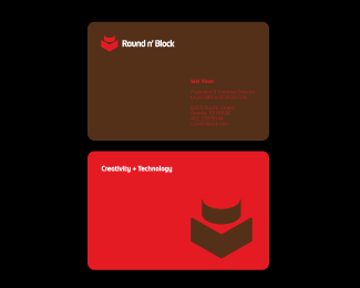
Logo concept for a friend's business which focuses on web design & development, and multimedia. The interesting name is based on Chinese philosophy regarding one's desire to possess ethical, noble and honest attributes (round) as well as dynamic and strategic attributes (block). He was looking for something very simplistic.
As seen on:
Sean Heisler
Status:
Client work
Viewed:
14124
Tags:
space
•
negative
•
block
•
round
Share:

Lets Discuss
the simplicity of this, while still conveying the message is brilliant. nice work.
ReplyHey, thanks, Colin! Good to hear from you, thanks for the comment!
Replyyes, I love it
ReplyFully agree what Colin said :)
ReplyGood job, Sean!
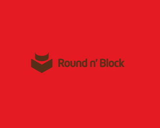
I first saw some sort of owl/badge/shield shapes. Then I saw the lego. Nice effect. I think it is strongest when the symbol is darker than the background, because it suggests a more expected light source from above.
ReplyThanks all, for the comments! Appreciate the gallery spot too!
Reply@Luma Thanks for the comment, you are exactly right, in this presentation where the background is darker it does slightly diminish the suggestion of a light source and it makes you see the symbol differently. The use of the symbol on the back of that business card mock up I included better conveys that. I might update the images here to better convey this. The guy I did this for is still creating his brand (he's a designer too) and so it's all fluid yet. I appreciate your comments!
actually reminds me of one of those oriental spin tops too
ReplyPlease login/signup to make a comment, registration is easy