Athletes Movers
by SeanHeisler • Uploaded: Mar. 21 '13 - Gallerized: Mar. '13

Float
(Floaters:
64 )
Description:
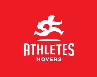
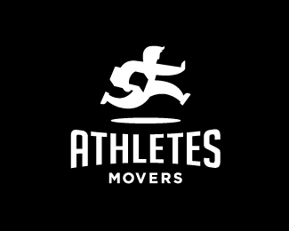
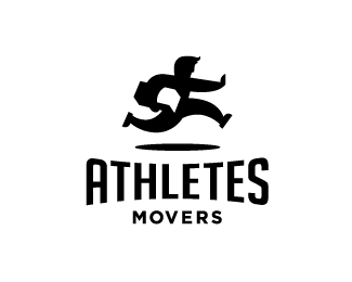
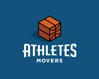
Concept proposal for Athletes Movers, a traditional moving company serving the east coast in the USA. Final mark here: http://logopond.com/gallery/detail/192924
As seen on:
Sean Heisler
Status:
Unused proposal
Viewed:
14692
Tags:
fun
•
football
•
athlete
•
running
Share:


Lets Discuss
Like very much. Nice use of negative space.
ReplyReally nice
ReplyLike It.
Replygood choose to be in gallery
Replylove this work
Very fun and clever. Well-drawn too. Great job!
ReplyGuys, thanks so much, really appreciate the comments! Had a lot of fun with this project. Thanks for the G Spot too! :)
ReplyVery fajne!
Replylove everything about it Sean!
Replyhaha Sean, did you really just say G Spot? I'm dying here.
ReplyA brother for Ogden Plumbing! Great!
ReplyThanks, again, all!
Reply@Luma, ha ha, yep, been pointed out. Different though. Love that one!
@Tabitha Ha ha, Tab, wondered if someone would get that. Only fitting a female got it first! ;) Thanks for commenting, good to hear from you.
Awesome concept and realization.
ReplyHaha, only fitting that Tab got it first. Great logo, Sean!
ReplyThis looks too close to Ogden Plumbing for comfort. Sorry, Sean.
Replyhttp://images.google.com/search?q=ogden plumbing logo
Thanks, Jovan and Kevin!
Reply@epsilon - Been pointed out. You know how many running people logos are out there? Compare the lines, the pose, it's as different as any other running guy logo out there. They went with the other concept anyhow. Thanks.
Sorry for bringing it up. I definitely meant brother not twin!
ReplyNo, it's ok, Luma. It had been pointed out at Dribbble by someone too. Problem is it's a running person and it involves an aspect of negative space, but beyond that they are different. I haven't created anything here that hasn't been done with the idea of someone running and delivering something. Do some searches at LogoLounge and you could build a small publication around them. I tried to be cognizant of all the ones I found and the Ogden mark when I created this so that I developed my own unique take on the well traveled genre and if you side by side them they are noticeably different. Nobody owns this concept, it's timeless and will forever be used to communicate delivery and dedication.
Reply^ well said.
Replylol Kevin.
ReplyI like this logo too, feels very dynamic and polished
Replylike what you did with that brick brow, a bit of update since i last seen this :)
ReplyNoce to see it in galery. Very strong symbol. Funny,,,, a while ago i did some work for the same project: http://logopond.com/gallery/detail/190082 , but your symbol is much more dynamic and iconic.....:]
ReplyThanks again, all, appreciate the comments!
Reply@aurickus Yes, I saw that a while back. I asked him about it and he said you had worked on some logos for him at some point but didn't give me any other details. Nice guy to work with. Thanks for the comment.
Great work Sean like all yours logos! >.< remaind me a little cpeople.ru logo ;)
ReplyPlease login/signup to make a comment, registration is easy