Well Works Drilling ver. 1
by PhantomNerifes • Uploaded: Jul. 17 '12

Float
(Floaters:
0 )
Description:
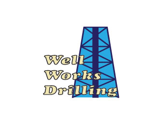
The first version I used a Cooper std font (Bold Italic, 36 pt) I figured the black stroke and light yellow fill to the text would be readable on most backgrounds, so i experimented with it.
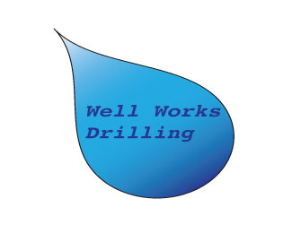
the second version I used a Courier font (Bold Oblique, 28 pt) and I made different shades of blue as a main color feature to it, but based on previous works gradients don't seem to fly.
Status:
Student work
Viewed:
1951
Tags:
Water
•
Drill
•
Logos All Around
Share:


Lets Discuss
I like the fact that you put in an oil rig in the back but the blue back ground needs to go. Black and blue do not play nice together. I think it would have been more fun to see oil being spouted out of the oil rig and the words being on top of that oil spout. Your doing a lot better, keep it up.
Replyactually on a side note, i wasn't exactly sure if the rig would be visible with white so that's why i chose blue.
ReplyPlease login/signup to make a comment, registration is easy