Atlantis Vision Studios
by PhantomNerifes • Uploaded: Jul. 21 '12

Float
(Floaters:
0 )
Description:
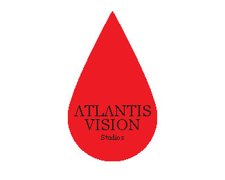
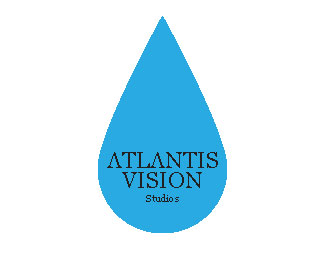
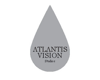
Edit: I chose Georgia font as a consistent lettering, but i decided to go with the water drop idea better since it's simple. the color is a problem so i chose four other colors to see which one would be better.
Status:
Student work
Viewed:
1303
Tags:
Atlantis vision studios
Share:


Lets Discuss
Not sure how to change it to be visible. it's probably my side though, idk.
ReplySaid this once before and will again, black and blue do not play nice together. Like the design though, a lot better than the ones before. I would still lose the gradient, not a good thing to have when it comes to using them for logos. Font looks great and works well with the logo.
Replyid agree with bryan on how black and blue don't go good together. and i don't like how you have the black background with the water background. it'd look better if it was just the tear drop, i personally like that background better. but I'm not sure one the boat house part is, I'm not sure what it is. it reminds me of a haunted house. id fix that but i like the concept though and i like the tear drop idea.
Replyand with the waves background you can defiantly tell that you stretched the haunted house picture. so if you end up using that one id fix that.
Replythis has nothing that excites me. i look at this and all i see is that big tear drop which i instantly put with a cheap plumbing company. i don't think you would have met the customers needs. it doesn't tell me that they deal in antiques in any way.
ReplyPlease login/signup to make a comment, registration is easy