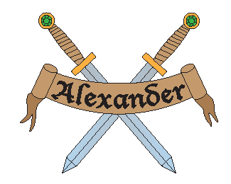
My personal logo
by PhantomNerifes • Uploaded: Jul. 25 '12

Float
(Floaters:
0 )
Description:
New form: take my last name, which is a very generic last name, and make it seem old. Made it into a banner and a guard. i'm not exactly thrilled by the guard, but i think it gives the name a nice touch.
Status:
Student work
Viewed:
1253
Tags:
Personal logo
Share:

Lets Discuss
I'm feeling this at all, it feels to little boyish. i don't like how its like a video game type or cartoon. but i do like how the phantom looks but thats about it. I'm sorry but I'm just not digging it, id like to see something a little more adultish and more like a design logo then something like zelda.
ReplyI was curious about the tracing for the original picture, but the phantom look was intended. my original idea was to put a phantom of the opera mask in front of a tidal wave, but i trashed that idea. I'm open to ideas on ways of improving the logo as well.
ReplyLose the face and keep the raven look and you might Try have a better looking logo. This does look very boyish and that like you said you traced another drawing. Try just keeping the raven look.
ReplyI don't like the swords but this is better than before.
ReplyPlease login/signup to make a comment, registration is easy