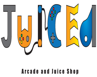
Description:
A logo for Felix's good shop in Utah. I discussed with him what he was wanting for a logo and he described how he wanted an arcade and a juice shop for young people (ages 13 - 23?) to hang out. he even described in detail how he wanted to hold tournaments and give out prizes. he also described how he wanted his juice shop to be known like Jamba Juice in a sense.
Status:
Student work
Viewed:
1866
Tags:
Games
•
Juice
Share:

Lets Discuss
I like the concept of the logo, but its hard to read and understand what the meaning behind the logo is. I think it would have been great to see the controller connected to the name rather than be part of it. The colors just do not seem that fun. Try using more of the ȁCSuper MarioȁD colors.
ReplyI was trying to go with the colors of the store inside after discussing with the owner about his store for a bit. I'll keep in mind the classic colors of mario, and i'll discuss it with the owner as well, see if he likes it as well.
Replyi think your concept was way over thought, you have so much going on, with the colors the gradients and the overalll juxtapotion of each letter. its hard to see look at it at a glance and know what this logo is for. if it had a bit more consistance i thnk i would enjoy it better. cheers.
ReplyHmm. Looking at this gave me a headache. That's probably not in the client's best interest. I would definitely consider toning it WAY down, removing the gradients, the strokes, the pointlessly warped letters (especially the E).... and I could be wrong but this looks like it was made in MSPaint. Is this done in vector?
ReplyI'm sorry but I'm not a fan, I'm not getting the concept across. it is very confusing and messing looking. having to put at the bottom that its an arcade juice shop then knowing what it is by the logo. i couldn't really tell that the last letter was a " D". it needs to be cleaned up a lot to make your point across clean and simple. i agree with lance on it being over thought. And the colors just need to be changed altogether.
ReplyI think that the whole gaming theme needs to go. It doesn't do anything for the logo at all and I'm sorry to say but it looks like a childs art project from school. I know you were going for the them of the store and what it's all about. But I think that you can still do that by making it simple and not so many colors.
ReplyI like the feedback from everyone, and i was expecting it to turn out to be terrible. I can try to tone it down, but I still would like to get the message through that it's a gaming lounge and a juice bar.
Replya simple graphic of a game controller linked to a blender over a simple font treatment would have done all the client asked. perhaps make the cord kink like lightening. one, two or three colors max. I can't see kids being able to read this, let alone infer a juice bar. and what program did you design this in?
Replyhttp://www.logolounge.com/wd/uploads/13705_179929.jpg
ReplyThe link above is for the Akadental Dental Clinic by Obus Creative. If I had this design brief, I most likely would've explored a similar option.
Please login/signup to make a comment, registration is easy