Float
(Floaters:
17 )
Description:
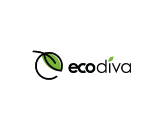
Eco-friendly skin care products. WIP
Status:
Unused proposal
Viewed:
6887
Share:




Lets Discuss
Thanks for the floats, Mel, Joe, and SquareLogo.
ReplyHmm... very nice icon. Leaf instead of the dot on i? Well, no. Remember, one focus... it is competing with the mark imho. Typography needs further work, but you already know that :) Anyway, good work Kev!
ReplyYeh, i think too that the dot on i is a bit too much, and also agreed with logoholik about the necessity of editing a bit the type kerning. The symbol is nice on it's own.
ReplyThanks Bojan and Alex. With your comments and mine, I've convinced the client to omit the leaf/dot. She's opted for the leaf/girl design, so I'll post up a final soon. Thanks again, guys!!
ReplyPlease login/signup to make a comment, registration is easy