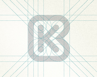
AC monogram
by OcularInk • Uploaded: May. 16 '09

Float
(Floaters:
18 )
Description:
A + C Monogram
As seen on:
Ocularink.com
Status:
Unused proposal
Viewed:
16200
Share:


Lets Discuss
Yep, it's better. Nice!
ReplyDefinitely this one. Masterpiece throught simplicity. Love it.
ReplyVery cool A even better C
ReplyThanks Sean, Jan, Dalius and Cerise. :-)
ReplyKudos OC!
Replylooks good!
ReplyThanks ME and Olivier.
ReplyI like this a lot. But the concept seemed familiar to me for some reason... finally I remembered why:**In my never ending quest for a great GH logo, I did a google search a couple weeks back (for %22gh logo%22) just to make sure that none of my ideas were already taken/used. Then I remembered seeing a logo done pretty similar to yours. Personally though, I prefer your execution%3B their seriffed 'H' seems to clutter the mark.**See it here: http://www.gebr-heinemann.de/en/company*
ReplyHi Graham, thanks for your comment. That's the first time I've seen that logo. It's a very nice mark. I agree, they have similarities and can see why you would be reminded by this logo. I'm glad you prefer my execution though. Cheers! :-)
ReplyLike this logo.I am looking for a logo for my name.This monogram kills me,I like,but now I have to forget it and try to invent a new one,damn it :).Your work is fantastic
ReplyThanks Alex!
ReplyVery nice work! Look what I just found:
Replyhttps://www.behance.net/gallery/18596723/Logos-Monograms-B-W-2014
Great find, Jeroen! Thanks so much. He's been contacted. Now we wait. =)
ReplyDamn. Wish I would've came up with this! Been exploring personal AC monograms for years now to no avail. Well done!
ReplyThanks, Andrew!
ReplyPlease login/signup to make a comment, registration is easy