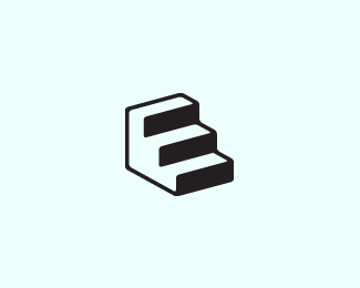
Description:
The ELEVATE logo symbol has a hidden element. Can you see it? If you look closely, you'll notice the negative space within the symbol strongly resembles the letter 'E'. This logo can work for any company wanting a a modern and simple approach. In addition, this logo symbol can represent uniqueness, intelligent ideas, vitality, upper level quality, etc.
As seen on:
Sold
Status:
Client work
Viewed:
18743
Share:


Lets Discuss
I haven't seen it - nice icon
Replythis is great kevin, absolutely love it! well done
ReplyThumbs up!
ReplyYes Kevin it has. http://tinyurl.com/o9dmjl**Nice work. %3B)
Replyman, i had such respect for you Kevin, how could you blatantly rip something like this! :)
ReplyOh wow! What a great response, guys. Thanks!**@firebrand : LOL, Roy!! Cheers!!*@gyui : Haha, George, you know me. :-D
Replyenvy
Replynice, but i am sure, yes!*but it is not problam i think...
Replyclose...but yours is way nicer*!http://www.lightboxgraphicdesign.com/lightbox/images/portfolio/logos/new%2520logos/Staircase3.jpg!*www.lightboxgraphicdesign.com
ReplyThanks Sean, Rob, and mister jones. :-)*@mister jones That's a great find. I'd say I'm in the clear. Thanks for the compliment.
Replyvery clean, lol at firebrand.. fail!
ReplyThis mark is awesome! Great use of negative space, too!
ReplyPlease login/signup to make a comment, registration is easy