Unused concept
by OcularInk • Uploaded: Feb. 22 '08

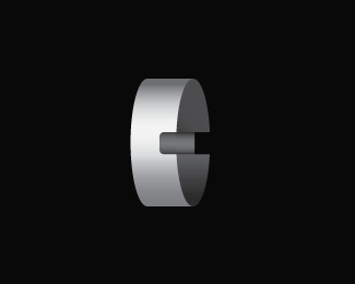
Float
(Floaters:
14 )
Description:
Unused concept : C/nail mark
Status:
Unused proposal
Viewed:
4715
Share:


Lets Discuss
I like the simplicity of this one and it seems quite balanced. Goodluck!
ReplyDamn man, very nicely done! I never would have thought (when seeing ur wrench) a nail would be the way to go, but it definately hits the spot.**It only seems a bit bleak here though, other than that: lovin' it!*Curious to see your typo solution with this.
ReplyOcularlnk this is very nice, and good luck with this...maybe to try some darker color tone, some dark gray...maybe ???
ReplyWould you not say that when the nail is in this shape that its a result of a failed hammer hit?
ReplySure, I guess you could say that. :-%5C
Replycan't help seeing a condom...
Reply%5E That's one sharp wiener!! :-P
Reply@ dache : You could also say Carter %26 Carter is adaptable to their client's needs. They are flexible. But just for the record, if you can hit a nail and the result ccomes out looking like this, failed hammer hit or not, I'd say you are pretty talented. Your perspectives always give me a good laugh. Thanks.
ReplyLOL 'failed hammer hit' when will this guy stop?**Dache, if you can curl a nail with a hammer, you are not in the right business
Replyoh, nice one ocular - I 'd increase the contrast but concept is great - keep up the good work
ReplyThanks for your *constructive* criticism, bro!! Contrast has been increased a bit. Is that enough?
ReplyGreat one Oc, really. I'd suggest to make the highlights a little brighter.
ReplyKev, the highlights could be white and a couple of white lines (nicks) in the neck of the nail would remove the condom connotations. What do you think?
ReplyI might add that I didn't see one!
Reply@ Art : Thanks, dude! I'll try it out.**@ firebrand : I will definitely add the white lines (nicks). Fantastic idea!!**Thanks, guys!!
ReplyThis is what I mean Doc. (Although this one has been badly hit) http://www.davidshrigley.com/sculpture_htmps/nail.html
ReplyDude, that's so weird. I had that exact picture (amongst many others) as reference while sketching out my ideas. I better get to work! Thanks, Roy!!
ReplyGoogle huh? %3B)
ReplyIndeed. :-D
Replyconstruction - is tough stuff - that is why I was saying to increase the contrast, why are you being 'soft' about it, you know what I mean?...this would look best in black and white as it has that classic logo feel
ReplyKGB had a similar idea - see how he uses yellow and black**http://logopond.com/gallery/detail/2575
ReplyI suggest u check out Shrigley altogether (since you probably just googled nail) ...if you dont know him. Not everyones cup of tea ...but his dark bizzare humour and style would sertainly amuse some of you. **About the mark ...I have to agree a bit with Dache. But that could have something to do with the last bend of the nail. Now it bows a bit in shame. Maybe straighten the head of the nail to give that perfect halv sircle. Also with the bent head it looks a bit more flexible than it has to be. But you are definitely going somewhere. Good work so far
Reply@ raja : The reason for the soft colors is because the client wants something that reads both construction and consulting. In addition, they want something more elegant than your typical 'construction' logo. So, I was hoping the bold and heavy mark contrasting with the soft colors would lend itself to both ideas. By the way, KGB's logo kicks ass. He is spot on with his color scheme.**@ actiondesigner : Thanks, action!! I can see Dache's point, but I also think it's a bit of a stretch. Take Apple's logo for instance. Because it's been bitten into, this can also suggest that it is incomplete. Certainly that is not what the designer intended the logo to convey. My message for this logo is to evoke structure and sturdiness. The nail is also the backbone to construction. It holds everything in place. To me, this concept is still a success. I'll try some of your tweaks. One point to mention, when I tried the design with the head of the nail at a 90 degree angle, the mark wasn't as engaging. The way it is here almost lends the idea that the head of the nail is also the serif on the 'C'. Most C's also end at an angle like it is here. Just some thoughts.
ReplyGuys before any of these Kevin Horvath did a James Goode Construction logo using the J and C hooked together it's in the Big book of Logos. I see nothing wrong with the cleverness of tweaking a nail. Good thinking Kev. may have been done but great minds think alike.
Reply@ LOGOMOTIVE : Thanks, man.**And thanks sandhya, michiel, and Muamer for your comments.
ReplyYou make valid points and I dont disagree with your execution. Just some concerns that needed attention. You can defend them and thats good. About the apple logo - dont know if you imply that it could be incomplete because it is missing a piece ...or incomplete because it hasn't been totally eaten. I would agree with the latter. Anywho ...I get your point about your concept. You are right to stick to it. Im just being a pain in the ass client and you should defend what you believe in. Don't compromise%3B)**The head being serif would strike me either way ...that part works really well. You may have a point about the bend making this more engaging. **Like some suggested ...maybe some more contrast. Looking forward see the progress and the end result. *
Reply@ actiondesigner : Thanks again for all your valuable and honest feedback. It means more than you know. I have until Tuesday EOD to finish this next round of comps. I better get to work. :-)**@ Climax : Haven't tried that yet. Let me see what it looks like. Thanks, man.
Replynice. reminds me of my Scott Construction logo. http://logopond.com/gallery/detail/2575
Replysorry didn't see that raja and you had already seen it. This is nice.
ReplyThanks, Brian. Was wondering when you'd chime in. The concepts are indeed very similar. Well, this never got used. Happy Friday!!
ReplyPlease login/signup to make a comment, registration is easy