PriQuest 3
by OcularInk • Uploaded: Feb. 07 '08 - Gallerized: Feb. '08

Float
(Floaters:
29 )
Description:
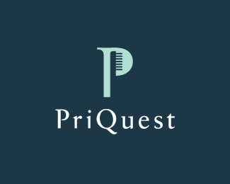
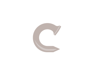
An old concept developed for PriQuest. They are a dentist group. After discussing with the client, it was determined that they wanted more emphasis on the word 'Quest'. For that reason, 'Quest' is bold and the logo mark reveals a hidden 'Q'. This project has come to a halt, but will hopefully pick up soon.
Status:
Unused proposal
Viewed:
16505
Share:


Lets Discuss
It's a good logo Kevin, the hidden Q is a nice touch. The only issue I have is that it's pretty 'spiky' and aggressive for a dentist! If they are happy with it, fair enough - but I would be looking for something softer ...
ReplyHey Andrew, I think you make a good point. One thing to note though, this company acts as a mentor ship to other new dentists needing a place to start their practice. The company gives these new dentists the chance to learn from the best and to have an opportunity to start their own practice. It's a very intense program. The client requested a sort of nautical theme, so this was just one option. Thanks again!!
ReplyI get it... 'Quest' it's a compass, because the young dentists need to 'find their direction' :)
ReplySpot on, Hayes. :-D
ReplyOk, I see where it's coming from. The spikes just gave me the creeps - in fact, I don't think that going to the dentist is as bad as it used to be%3B the last time I went it was all ultrasound %26 lasers %26 gadgets like that. Didn't hurt a bit!! Unlike the gas %26 the pliers in the late 1970's ....
ReplyThis is very nice, Oc. I think you hit the brief successfully.
Reply@ drewboy : Haha, I hear ya, man. Fortunately it is a lot less painful these days. Gotta love technology!!**@ ahab : Thanks!! :-)
ReplyHaving your explanation, I think that you visualised the concept successfully.
ReplyI like the sense of depth you create so easely.*Without reading the explanation, it reminded me of those WWII anti-submarine bombs (as in finding nemo)
Replyvery nice bro
Replyspiky :) ... nice one
Reply@ Respiro: Thanks!! :-)**@ gstaltig: Interesting perspective. Thanks!!**@ raja: Thanks, bro!!**@ a_lanevski: Hehe. Thanks!!
ReplyVery cool. I thought the same as gstaltig, that it was an old anti-sub bomb.*I really like the hidden Q. I wonder if I would've seen it without the explanation? I should start looking at the logos really well first, then reading the explanations, ha.
ReplyHey guys, a fellow friend stumbled upon this: http://www.studentscrossingboundaries.com/**The designer's website is: http://kamarinlee.com/**Do I contact the designer or the website owner? How should I handle this one? Thanks!!
ReplyI agree OC, sorry AGAIN %3B-(
ReplyAs his project initials were SCB, he could have at least taken the Q out.
ReplyP.S. You can find his user name here (I saw this logo on his site):**http://logopond.com/gallery/detail/33180*
Replyatrocious copy...clown can't even trace, give 'em hell!!
ReplyThat rip-off is ridiculous!!!! Ocular i would be pretty pissed, the fact that he isn't even smart enough to spot the %22Q%22 in the brand, as pointed out by gthobbs, just says it all.
Reply@ Relevant : Great advice, Jon. I was thinking I should contact both, but just needed another opinion. Thanks!!**@ Logomotive : All good, Mike. It happens, ya know. Just been happening way too much lately.**@ smartinup : People must love me. :-P P.S. What is your name?! I always forget it!!**@ gthobbs : Was thinking the exact same thing, Glen. That freakin' idiot!!**@Hayes : Will do, Josh!! LOL!!**@ TILECREATIVE : Trust me, Lee. I'm annoyed!! Can't get mad though, some people just won't ever get it. Welcome to the world. :-D
Reply*simple, clear and creative. Great job
ReplyThanks a bunch!
ReplyNice logo bro!!**can you check this link,its a contest on crowdspring.com and a designer won a ripped copy of this logo.**designer portfolio: http://www.crowdspring.com/user/rezevOne/**contest link: http://www.crowdspring.com/project/2287479_compass-auctions-real-estate/entry/2851637_compass/**And If you didn't see any thing ,i upload a screenshot of winning design.**Screenshot : http://img443.imageshack.us/f/compassk.png/
ReplyThanks, Raj. I contacted crowdspring and this should be resolved now. Cheers!
ReplyThey should remove a whole site.
ReplyThe world needs more people like raj.
Reply%5EFor president of The Hacked-Designs Spotted Awareness Organization? Boy would that make for an interesting url...he's got my vote :)
ReplyOh btw Kev, this is very nice.
ReplyYes they should, Srdjan, yes they should. :-) Chad, I couldn't agree with you more. Haha, Joe, The HDSAO. He's got my vote too. P.S. Thanks for the kind remark.
Replyyea, pretty ridiculous.. **quoted from crowdspring*%22We just wanted to let you know that we've issued a cS award to user %22BRI8%22 for their great work - congrats, BRI8!%22**I'll never visit crowdspring again..
ReplyPlease login/signup to make a comment, registration is easy