Float
(Floaters:
44 )
Description:
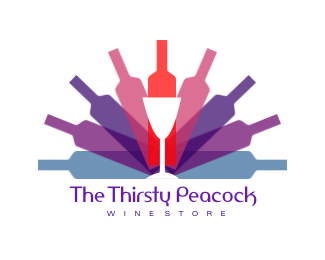
Logo developed for a wine store business.
Status:
Nothing set
Viewed:
41144
Share:

Lets Discuss
very nice combination of colors - like the typo. Nice work, really.
ReplyThe types not that flash, but the mark works brilliantly with the peacock theme. Well done.
Reply%5E I concur
Replythis is one of those logos that humbles me...brilliant mark
Reply'Lucida Handwriting' doesn't do it for me though.
ReplyThank you all! Yeah like I said...the client chose this type, not me. I don't like it either. I'll try to persuade them to consider a different type. I'll see what I can do:) Cheers!
ReplyHave you tried swapping the lilac and the purple?
ReplyI hear you about the typeface issue, the clients are just like that. But as for the logo - it seems a bit busy to me, you can try limit the bottles to 7 instead of 9, and ...make the bottle silhouette to look more like bottle silhouette - smoother, maybe.
ReplyLucida Handwriting? Ah, why would the client choose that? It just doesn't work with this logo. It's obviously not your fault though. I hope you can change their mind to something a little more professional. The rest of the design is pure genius though!
Reply%3C%3C'Lucida Handwriting' doesn't do it for me though.%3E%3E**indeed...**but also, clients 'ask' for consessions... unfortunatly.
ReplyGreat work.**I'd present my own version personally. Clients have a tendancy to ruin great design. The mark shines. All this needs is a good basic sans font.
Replythis is really beautiful.
ReplyI agree with you about the font. Everything else if fantastic!
ReplyGreat concept. I wonder how it would look with 7 bottles instead of 9
ReplyThe first word that came to my mind (before seeing others use it here as well) is - brilliant!
ReplyThank you all for your feedback:) I have updated the image- this is now the final version. Cheers!
ReplyFinal version but I still have a few issues:*1. The tiny fragments of red points at the top corners of the glass*2. Wine Store is not centered*3. Word spacing after %22The%22 is way too loose*4. The glass stem seems a little off center to the right**Looks good.
Reply@gthobbs- thanks for noticing! I think everything you pointed out needs tweaking. Although this is the final version, I have not sent the final files to the client. Thanks for your detailed evaluation:) I appreciate it. Cheers!
ReplyLove the new font, what is it?
Replylove image U design but i think the size of %22wine store%22 is small. If it bigger, may be it better.
Replythat was a pro design i love everything on it thank u
Replycongratulations man!
ReplyWhoa, this I didn't know this logo was made by PATRICK as in my friend Patrick. :) Awesome work bud.
ReplyWhat do you guys mean by %22mark%22 when you say %22brilliant mark%22? Is %22mark%22 another word for %22logo%22?
ReplyLove the type, LOVE the concept, what a cool idea. Colors are great too. I'd give this an 8/10!
Replycool :)
Replyabsolutely love it!
ReplyVery good! Very imaginative
Replyso creative.
Replyvery nice colors. good work!
Reply*Cheers!*
ReplyThe wife loves this one... Very cool wine related logo!
ReplyI like it, there is a tiny line under the glass, and I think it would look better if tat wasn't there. Also a sans serif typeface would set if off perfectly (Gotham Bold?)
ReplyThe spamming is out of control, really getting annoying to see day after day. There has to be a solution to stop it. David??
Reply%5EI agree, this is very dangerous for these people to the site to the grotesque.
ReplyHi David,
ReplyCouldn\'t you ban all comments that contain http:// or www?
Please login/signup to make a comment, registration is easy