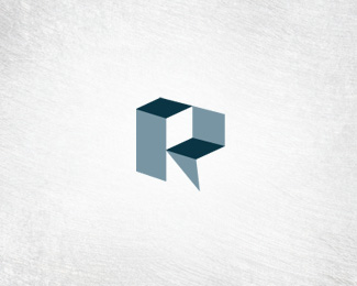
Description:
3rd concept.
Letter "R".
company that designs and engineers custom manufacturing equipment for large factories that turn liquid into a powder form.
anything like it in use?
will be uploading a few more. looking for feedback, please. thanks.
WIP
Status:
Unused proposal
Viewed:
3179
Share:


Lets Discuss
while its a fab shape I dont see the r, sorry, I do see p and a L maybe my eyes play tricks on me its 12.35 and I'm banjacked.**colors are good.
Replyi can see the R, the way presenting the R is very nice :)*maybe what you need is add brand name at below**i think is more suitable for construction or architecture, because in another way it look like a building at simple way.
Replyweird, after a while i look through the logo, it can be many shape.**it trick my eye.**i think different people will see different shape.
Replymy eyes see R right away. It has a strong architectural feel. *but yea, after looking at it for awhile, i start seeing things like %22a cube in the corner%22, or %22two buildings%22*hmmm not sure if it speaks %22turn liguiq into powder form%22 if you want associate with that aspect.
Reply%5Eok seeing things with a little more clarity this morning, I did see an R but the aftermath is a combination of P, L. Its a challenging brief, and whats the end result here to show the 'process of change' or the 'final product'?**Personally I keep the the image in my head of an R been filled with water and and turning into powder as you progress up the R... **Regardless this is good execution and could possibly be recycled if its not used in this application...
Replythanks for the comments. I believe need to rewrite the description of the company. this company is actually the engineering company that custom designs and builds the equipment for the industries that actually turn the liquids into a powder. So I am trying to play more to the custom engineering side. these guys are the actually engineers, designer's and builders of the manufacturing equipment used in the factories. make sense? I am terrible at writing, sorry.
ReplyR, nice work! (I don't need just a %22strong%22 background texture... %3B)
ReplyI really like this... the R is pretty obvious straight away. Nice work.
Replythanks Mishka and to you also Alex. still working on the mark.
ReplyPlease login/signup to make a comment, registration is easy