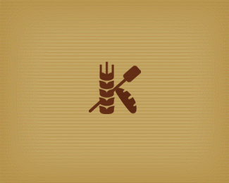
"K"
by Mikeymike • Uploaded: Mar. 08 '11

Float
(Floaters:
33 )
Description:
WIP_ letter "K" for a bakery. Does it work?
Status:
Work in progress
Viewed:
2603
Share:


Lets Discuss
Thoughts?*Thanks.
Replymike, i think this works. good job.
Replythanks, Colin.
Replyperfectly read
Reply%5E perfectly bread? no?
ReplyIt is perfectly read out**Excuse for my English :)*
Replyno no, your english was correct, i was just doing a play on words. bakery - bread - read.
Replyok:)*Nice job
ReplyDefinitely reads, nice work, Mike. I'm wondering if the lines on the bread might be simplified when considering the mark used very small. Possibly three lines, perhaps slightly larger, more graphic and not so subtly detailed. Just a thought.
ReplyOne more thought as well, I think that it would work with the solid grain as well (instead of hollow one as it is now). But nice overall feel to it mate!
Replyhumm...good feed back. thanks Sean and Alen.*I think I'll sit back, have a slice of bread and give that some thought. cheers.
Replyhey, Mikey...very interesting and original. As i saw before and see now...i can easily say %22as always!%22 %3B)
ReplyI'm a fan.
ReplyDeiv, Joe thanks, guys.*Just about to up date with a newer version. Hope your still on board.
Replyvery nice :)
ReplyUPDATED: simpler bread. Also have another version with the grain solid in color.
Replythis is very cool mike :)
ReplyAlex, Mathias thanks guys. still deciding between this one and the other.
ReplyVery interesting Mike!
ReplyNice, mike! Like the simpler bread. Feel free at any time to tell me to shut up, but I had another suggestion. :) On the wheat, the little %22points%22 that stick out the side of the wheat on the sides, they almost feel like they need to either need to bump out a tad more or completely lose them because they are so small it could be mistaken as an error (if you know what I mean). Lastly (promise) how about extending the center stroke of the wheat at the top up just a bit so it's a little taller than the other two on the left and right? Feel free to ignore, buddy! :)
Reply%5E Wish I knew how to type.
Replyvernics, thanks for comment.*Sean, still working on this. I see your point. I had them all straight early on. may have to go back that way. Sorta like the other concept now though. it seems cleaner. got to back away for a bit, maybe.*thanks for the insight. always helpful.*cheers.
ReplyThanks, Thierry. kind words indeed. fan of your work also man.
ReplyPlease login/signup to make a comment, registration is easy