Float
(Floaters:
44 )
Description:
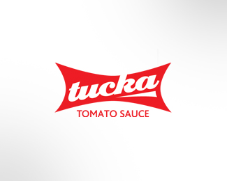
Name and brand concept for snap pack style single serve sauce range.
Status:
Unused proposal
Viewed:
10652
Share:


Lets Discuss
I like this. I can easily imagine it on small pack bags for the single use. Type is great.
ReplyThanks for the comment Hyperborea - much appreciated. The idea was to create an identity that was strong at minimum size while still intimating the slight twisting required when using the packaging. Wanted to also convey a slightly retro feel - ie traditional, wholesome, tasty.
ReplyLove the retro style here. Nice execution, will shrink exceptionally well when downsized for use on packages of smaller size (as with packets of sauce or whatnot). Also lovely in its own right, as pure typework alone.
Replygreat type!
ReplyThanks JF and Jessica... appreciate the floats and kind comments.
Replygood job buddy.
ReplyThanks for the float and comment Colin.
ReplySimply and with taste!
ReplyLove it! Can you send me a print? Tucka is my nickname. happy to pay
ReplySo good, screams Super tomato! Love it.
Replythat's tasty.
ReplyThanks Margaret, Rayf and Karmakazi - appreciate the comments and floats. Will try and sort something out for you Tucka / Margaret...
ReplyVery nice work !! it's possible tell me the font? Regards from Spain =)
ReplyPlease login/signup to make a comment, registration is easy