Description:
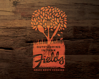
Logo for Farmers Market initiative with cooking demonstrations using local produce at various locations around the country.
Status:
Work in progress
Viewed:
8228
Share:


Lets Discuss
This is FANTASTIC. I can't say enough good things about this design. Concept, execution, quality of graphics%3B super work here.
ReplyI think the tree roots are too much, and I'd like to see it fully opaque.
Replyyou're right, JF, this has a great feel, though I do get a little lost with a few things: I don't know whether it needs the thin orange connectors in the script font. I'm also not totally sold on the slightly darker roots behind the type, nor the grass. The mark feels like it should be one color only, as if it was stamped on the wood. And while i love the paint texture on the lower half, I get confused by the cleanliness of the top half of the image. Maybe it's just me.
ReplyI know exactly where you're coming from. I think its potential would show better without the (sorry to say) distracting wood background....the roots and the type is actually one of my favorite parts though.
Replyditch that background asap.
ReplyThanks all for looking in and your comments - the painted on wood effect was just one of the many 'concept in use' applications I showed the client - in this case it was for an advert / poster that used the timber background as the whole image with the logo in one corner. It added to the farmers' market atmosphere when seen in context with the campaign. In reality the logo was designed as a monotone identity, but I liked the rustic, down-on-the-farm earthiness of this rendition hence my inclusion of it on the Pond. Rather than detract from the concept, I feel it only enhances the brand and helps tell the story with authenticity. I might post the opaque version sometime to help some of those who have such an issue with the timber. Oh and the logic behind the distressed, earthy finish of the lower section? Simply that it is indicative of dirt and earth beneath the surface while above ground is clean, sharp and crisp.
ReplyI'm all for the wood background here, and it's one of the things that drew me to it in the first place. It totally fits and feels authentic like you were saying. And you've now sold me on the dirt idea! You have a lot of great work, my friend! Nice type in most everything you do, which makes me happy.
ReplyThanks Nathan - your kind words a much appreciated. I too am a sucker for type that is well handled... although my own typographic skills have a long way to go I think when I see the work on the pond.
ReplyWow, it's really cool, Alexander!
ReplyThanks Folky... nice of you to stop by and comment.
ReplyPlease login/signup to make a comment, registration is easy