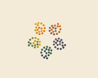
Lion + Location
by HelveticBrands • Uploaded: Jan. 13 '11

Float
(Floaters:
58 )
Description:
Work in progress.
As seen on:
http://www.helveticbrands.ch
Status:
Work in progress
Viewed:
6103
Share:


Lets Discuss
change your name to logo scientist or something :)
ReplyThis is nuts...I can actually see the lion. Two fricken shapes and you pulled it of:)
Replyclever mark:)
ReplyYeah, this one is actually quite smart!
ReplyLess is more example.
ReplyCrazy!
ReplyFantastic work David!
ReplyReally dig this one DP!
ReplyLooking forward to seeing how this turns out.
Replybrilliant use of shapes at its simplest. real nice work,David.
Replyvery nice, almost be a shame to put type with it.
ReplyStrong.
ReplyAgreed! Strong.
Replysuperb execution, I've seen a lion in there too!
Replyagree, amazing work:)
ReplyOUTSTANDING!
ReplyVery nice!
ReplyProbably the best one of yours so far.
ReplyThe colors help a lot here to make it look like a lion. I'm wondering how this would look in white and black. Cool mark.
ReplyFaved a while ago but didn't comment on this. This is gold!
ReplySaw the lion straight away. Nice job.
Replygreat!
Replybrilliant idea
ReplyThanks.** * ** * *
ReplyPlease login/signup to make a comment, registration is easy