Float
(Floaters:
14 )
Description:
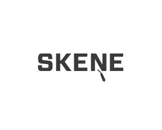
A bit of low budget mischief, a startup business - Skene Plastering.
Status:
Client work
Viewed:
4003
Share:
Lets Discuss
Nothing low-budget about this, looks great JH.
Replyyep.. looks good buddy
ReplyThanks guys!!**I find it very therapeutic, to take on a 'budget' identity job every now %26 then...makes me appreciate the 'bigger' jobs more and, can quite often be...the bigger challenge. :)
ReplyReally nice use of the negative space, maybe the handle could be a little bigger for reproducing at smaller sizes?
ReplyThe idea is great, but the scale of the plaster tool is only visable in a big scale, maybe a prespective view to allow a biger dimention of the toll or a less bold type might help.*good job
ReplyNice simple and strong, josh.
ReplyThanks guys!!**In regards to scalability...print wise, so far it has been printed at 1/2 inch wide without issue. In the web environment there would be a scalability problems, but for the foreseeable future this mark will be strictly print-based.**lol @ Tony :D
ReplyThis bad boy's in production, we got the business cards from the printer yesterday...came up a treat. :)
ReplyI like the simplicity of this, very smart solution :)
ReplyThanks Alex :)
ReplyThanks Tony :)
ReplyPlease login/signup to make a comment, registration is easy