Description:
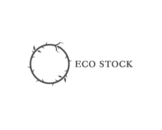
Eco Stock; Handmade paper & card with plant seeds strewn though it.
Printed on Letterpress via metal engraving (modern offset machines were crushing the seeds).
The 'Thorny Stem' motif is based on an Ouroborus, representing rebirth/infinity.
Was a limited print run during late 2003.
Status:
Client work
Viewed:
9096
Share:

Lets Discuss
The idea of these (mostly postcard sized) cards was to bury them in the garden once you're done with them %26 flowers grew in their place...recycling in a different context.
ReplyThis is very nice hayes, with a well thought out concept. My only niggle is that the type may be a little too small. Have you expiremented with the placement of the type? Is there any reason why it has to be placed inside the mark? This has great potential.
ReplyThanks Gareth, yeah this one is an old one (Oct, 2003) it was a letterpress engraving, type was put inside mark to keep the cost of the engraving down...it was originally underneath.**I guess the type is a little small, put it did print well (we only had money for one engraving at the time). Prints were made in black %26 dark green.
ReplySorry didnt notice that it was from 2003, i need to learn to read the descriptions more before making judgement. Nice work all the same.
ReplyCheers mate :)
Replythis one's cool, I like the look and feel. Yeah the type might have been bumped up a bit but good stuff.
ReplyNice, Hayes.
ReplyI really like this. It has a nice, modern feel while still being able to work in a classic application like letterpress. Very nice. I'll bet these cards turned out awesome.
ReplyThanks Mike, Roy %26 Ryan :)**@Mike%3B I hindsight I agree with you, type could've been bigger, I'll make an update shortly with bigger type.**@Ryan%3B They certainly did :) I wish I still had one to put up on Flickr, paper was very tactile %26 had a 'parchment' quality to it...
ReplyCool. For the record, I think the type is fine at its current size. Any bigger and I don't thing there would be enough whitespace around it to make it stand out from the logo. If you want to do something to make it stand out more, I'd say making the branch thinner would be a better option.
ReplyWill certainly take it all into consideration... :)
ReplyUpdated. Here's the final design after last year's re-development.
ReplyPlease login/signup to make a comment, registration is easy