Description:
Old Town is a place for visitors to experience a touch of history and to experience great regional dinning, shopping and entertainment.
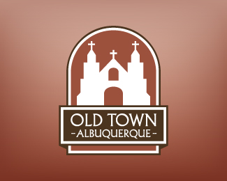
The development of the new logo was based on a few main principals, one, its use as a visual identifier for Old Town and two, making it look more inviting and less like an official state seal (the design of previous logo).
I wanted to steer clear of any cliché design elements and typogrophy that are overused in New Mexico and Southwestern design. Also, the design needed to stay clean and simple so as to be highly visible and easily identifiable.
The image of the church was retained as it is the heart of Old Town and the iconic feature people recognize most. It has such a strong visual presence that it is easily identified by visitors who will correlate the image on the logo to the actual structure, in a way, serving as an “X Marks the Spot”.
The composition was inspired from the niches common among the old adobe buildings that encompass Old Town, serving as an abstract background highlighting the church.
Status:
Client work
Viewed:
1554
Share:


Lets Discuss
Please login/signup to make a comment, registration is easy