Description:
Concept2_ Clear Vision
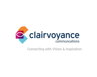
Research revealed the term clairvoyance came from 17th century French with clair meaning "clear" and voyance meaning "vision". This new found knowledge ignited my creative spark; I started to explore the notion of an ever-watchful eye overseeing / creating articulate copy.
The open ended right-side of the mark is representative of the verbal and communication of the said message.
Status:
Work in progress
Viewed:
2268
Share:


Lets Discuss
Hey guys, would really be stoked to get some constructive feedback on this design, as I'm very excited about this direction.
ReplyHmm, the concept is interesting and very esoteric, but I feel like it needs to rely on the tagline to provide that level of understanding. There is a big idea here, but I'm not sure if the mark is coming together yet. I feel like it's too %22here's the icon,%22 and %22here's the type.%22 I feel like the elements need better integration. Your eye has a v-shaped line of vision emanating from it's right corner. Could the eye be below the V in %22clairvoyance%22, and achieve a similar effect (in this case, the sight line would be upward)? In this scenario, I wonder if the colored pages would even be necessary. Play with this one some more.
ReplyPlease login/signup to make a comment, registration is easy