Float
(Floaters:
5 )
Description:
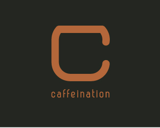
Concept_Drop by for a cup and we'll "C"/ see you.
Status:
Work in progress
Viewed:
1544
Share:




Lets Discuss
Nice solution with C as Cup.
ReplyThank mate, what do you think of the color choice?
Replylike, colors are very appropriate.
ReplyVery clever solution, Fabian!
ReplyNice one Fabian... color is good too. Did you try beefing up the mark a little? I could be wrong but right now it seems that the negative space is slightly over-powering the C. But great solution indeed.
ReplyPlease login/signup to make a comment, registration is easy