Description:
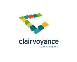
Here is the third concept. It is inspired by the great work of Ecsher.
The C resonates the the ideology of "Taking a step up" to that next level.
Status:
Work in progress
Viewed:
1614
Share:






Lets Discuss
Here again, the concept is very well thought out, and the Escher reference is very cool, but I don't think the execution is quite matching up yet. There's something weird happening with some of the shapes. I feel like the ones with notches and pseudo-3D edges look out of place. I think you're trying to suggest that these shapes are %22pages%22 that represent communications, but it's curious why some shapes have these notches and some don't. I'd play with this one some more.
ReplyPlease login/signup to make a comment, registration is easy