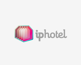
Iphotel
by Bitencourt • Uploaded: May. 24 '11

Float
(Floaters:
58 )
Description:
Iphotel its a webhosting from Brazil, this is the final version, but I'd love to hear what you think! :)
As seen on:
Iphotel
Status:
Client work
Viewed:
10647
Share:

Lets Discuss
amazing logo work - love it
Replyso much collors...and they look amazing together:)
Replylove the cube. hate the text.
Reply%5EHate's a tad harsh. crazy detail on the cube. Love it!
ReplyLove how you always experiment with something new. Very fresh, Breno.
ReplyThanks everyone, I'm still working on it, specially the type :D
ReplyThat's going to look really nice on a HD mobile screen.
ReplyHaha, I hope so, Richard! Thanks! :D
Replylove how this is progressing, Breno. Sweet indeed.
ReplyThanks Mike! The type isnt great yet, but i'm still working :D
Replyreally interesting where this is going, nice job
ReplyThank you, Tass! the client really love it too. Just received the approval now :D
ReplyWow, amazing work --- love those colors!! RGB colors, right? Or are they CMYK?
ReplyYou're feel color %26 light very good)
ReplyYes, JF RBG colors! *Thank you, LadyGrey! **:)
Replyas i said on dribbble, this is pretty amazing. not in love with the type chosen, though:p
ReplyCongrats on getting the clients approval. Absolute love your color technique here:)
Replythis is awesome.
ReplyDisco-Tech.
ReplyThanks everyone! I think this is the final version. Type updated, hope you like it. Btw, what do you think? :)
ReplyI like it a lot. Will this need to work on any applications besides the web?
ReplyI'm not really sure. But I'm working on another versions without all effects :D
ReplySo shimmery.
ReplyOh my goodness, I think this really needs to be in the gallery. It's remarkable work.
Replyso awesome to see you featured brother!
ReplyThank you guys! :)
ReplyWTF? *What is it? Beautiful? Yes. but - what is it?
ReplySorry, did not quite understand
ReplyI sure hope I see this in logolounge as an example of a trend...I mean, it's a jewel, it looks beautiful. Perhaps it would represent a new trend. The %22jewel%22 trend or something like that. Just love this.
ReplyDoes anyone see similarities between my logo and this logo? *This similarity would be detrimental?**http://www.brandsoftheworld.com/logo/viva-experiencias**Thanks for answer :)
Reply%5ENot similar, you're fine. Only thing that is the same is the hexagonal shape, but so do a million other logos too.
ReplyThis one is a league of its own, your free and clear buddy:)
ReplyThanks, guys. I agree with you, but unfortunately the client does not.**:/
ReplyThat is a pitty, still great job!
ReplyThank you Oski! :)
ReplyBreno, if your client is so concerned about supposed similarities, if you haven't done so already, it would be helpful for you to walk them through the specific differences between your design and Viva: custom type versus stock%3B icon-to-type orientation%3B light refraction/lens flare effects versus flat%3B completely different facet structure/internal patterns %26 colors%3B etc. It might even help if you Photoshop the two, side-by-side, so they can see them both occupying the same space. This will help accentuate the differences.
ReplyThank you for these tips, Jon.*In fact the client haven't replied my last email with such explanations. But the job is done, and paid, and they're using this logo, so I don't really know what happens, but think its ok. :)
ReplyPlease login/signup to make a comment, registration is easy