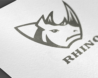
Rhino
by 1ta • Uploaded: May. 09 '12

Float
(Floaters:
46 )
Description:
WIP
Status:
Work in progress
Viewed:
6609
Tags:
•
Rhino
•
1ta
•
Hossein Yektapour
Share:


Lets Discuss
great ... but ... would like to see a much more simple version ....
Replygooood
ReplyThanks TaS And palattecorner
Replyhttp://dribbble.com/shots/553927-Rhino
ReplyThis is nice. I saw your sketch and was waiting to see :)
ReplyOne thing. The letter O is little bit off or what? Or its just me who saw this :)
Reply^ agree, the kerning is a little off. tighten up that 'o' a bit. turned out nice hossein.
ReplyGreat overall shape but I agree it could be simplified.
ReplyThanks Guys For Comment
ReplyUpdate :)
Hahah, So here it is... Nice reults!
Replyfloating:)
ReplyThanks Guys
ReplyNice work! Would also like to see a lil more simplified look, perhaps not quite a heavy on some of the strokes on the neck
ReplyThanks :o)
ReplyWow. Great Rhino.
ReplyThanks Logoswish
ReplyGreat logo!
ReplyThanks ALL4LEO
ReplyGreat Job, I like it :)
ReplyThanks beczukdavid :)
Replycute face
ReplyThanks LadyGrey
Replyhttp://i.istockimg.com/file_thumbview_approve/11290917/2/stock-illustration-11290917-rhino-head-charge.jpg
ReplyNow, this is confusing.
Replywonderful stuff Hussein.
ReplyPlease login/signup to make a comment, registration is easy