Float
(Floaters:
14 )
Description:
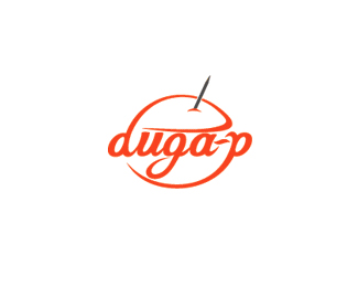
Logo for Duga-p, FASTFOOD.
Status:
Client work
Viewed:
9617
Share:


Lets Discuss
well implemented.
Replywhy is there a needle in my burger ?
ReplyI like it. **More of a needle than a wood spike, so best to take the angular-indented point away and smooth it.**Nice flowing type!
ReplyTnx for the comments.%0D*It's a burger, of course, but most of the people didn't see it (they ask: is it a apple or nut...?) so I add a toothpick. I tried to make it with a smooth end but I thought it's more obvious this way.
Replynice font.. but i didn't see dat is is a burger
Replyactually i tought it was an orange :P but i like the treatment on typo
ReplyPlease login/signup to make a comment, registration is easy