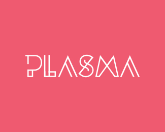
Description:
.. this is work in progress; the subject of the logo will be brought up later in the process; this is for a client, and I quite like it. I was just curious about your opinions. thanks
Status:
Client work
Viewed:
5628
Share:

Lets Discuss
nice type work !!
Replyvery very nice, great type!
Replythanks guys! i've grown attached to it a great deal.
Replynicely done!!!
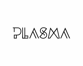
Replylooks hot victor. really enjoy all the forms here. The M is the only one that is a little inconsistent with the rest of the letters though. it feels like it might need some sort of parallel line somewhere to match the others that all have it going on. that said, i still really like it. Also, with the L, some of the paths look like they've been doubled up, so they're creating an anti-alaising effect on some areas of the path, and not others (small nitty thing - sorry). love it though.
ReplyReally apreciate the comments.
ReplyVergad.. i really liked the M before you pointed out what it's actually true.. i don't know if i'll change it. I'm torn :)
The L thing- if you are reffering to the tiny flaws there at the joints I think it's an export issue. I'll give it a look.
leave it victor, it looks really good. i wasn't sure to make the comment or not, so apologies if i've confused you. the overall logo is great - love that S. regarding the incy wincey flaws in the L have you converted paths to strokes? such a small thing, sorry to be a nag on what i think is a really nice bit of type work.
ReplyVergad, i asked for comments. It's usually why I post. Fine detail is the more appreciated for the comments. I've converted to outlines, yes.
ReplyAgain, thanks for the comments. I'm really glad for the pozitive responses.
prettily
ReplyPlease login/signup to make a comment, registration is easy