Description:
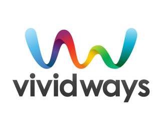
Logo design for Vivid Ways, a blog based on the topic of personal development and colourful living.
The idea behind the logo is the display of the V and W in the form of a ribbon, a symbol of life. With a full spectrum of colour linking straight back to the 'vivid/colourful' keywords of the brand.
Status:
Nothing set
Viewed:
19396
Share:

Lets Discuss
Bautiful!
ReplyBeautiful even :P
Replya very happy logo. nice job.
Replyit sure is cheerful :)
Replycool mark. the two seem to be competing though, i'd scale the type down some and maybe even make it a bit light grey (maybe not depending on how far down you scale it).
ReplyFresh brand and very nice logo. Nice job.
Replynice logo ... feel the type may be a tad heavy thou ... like it thou
Replyexelent, I like vw in the symbol. but there is something with the vividways type
ReplyPlease login/signup to make a comment, registration is easy