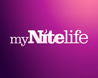
Description:
Logo design for myNiteLife, the Sheffield night life planner
As seen on:
myNiteLife
Status:
Nothing set
Viewed:
3638
Share:



Lets Discuss
I like how the moon and the 't' work together. It just always scares me if people make a background gradient dominate a logo. How will this come out if for some occasion it has to be printed B/W?**If it's for web-purposes only it's not a problem at all though :)
Reply@ Rein : I don't think the gradient should be what makes this logo work. It's all the other elements ( interesting type treatment, moon crescent for the dot on the 'I', etc. ) that contribute to it's effectiveness. If the background was all black, I don't see how that would change the design all that much. Just my two cents. :-)
ReplyMany thanks for the comments so far, as mentioned by others the logo certainly does work in mono as it was originally designed in black only.**For display purposes and with it being primarily used for web the fancy gradient was added, which extends onto the colour scheme and brand of the website it is for.
ReplyPlease login/signup to make a comment, registration is easy