Description:
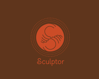
After all i tried to make it different..
the client is still want to go more deep as look more sharp in smaller version.. trying to achieve that.
Status:
Unused proposal
Viewed:
2172
Share:



Lets Discuss
Agree, much better! I quite like this a lot. Maybe go with a different S (or typeface)? something to resamble the mark a bit more.
Replydigging this...dont know about the dotted cirles..but overall looks yummy..:P
ReplyYes much improved. Love the hands symbol. That's probably all you need...the less is more thing may apply here.
Reply@Anthony- thanks.. trying to refine it more.*@Lecart- ya.. type is still not my fav but here just to fill the space.*@Nitish- thank bro.. dotted circles r to show motion of clay makers base.*@Cerise- Thanks a lot.*Thanks to all of you for ur support n views.
Replystrongest so far.
Reply@climax design- this is very personal for my friend.*@Mikey- thanks...
ReplyDigging the feel on this guy...very clay appropriate %3B)
ReplyThanks Michaelspitz...
Replygreat idea.
ReplyThis idea has come a long way. I really like where it is now.
ReplyThanks Jonathan n ru..
ReplyI feel the dotted rings unnecessary. They muddy up an otherwise clean concept. Nice.
Reply@theartistt- thanks i will rethink about it... :)
ReplyNiceeee:)
ReplyPlease login/signup to make a comment, registration is easy