Float
(Floaters:
6 )
Description:
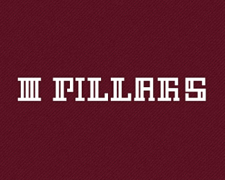
Reusing my old font..
Status:
Work in progress
Viewed:
1747
Share:


Lets Discuss
cool font ...
ReplyThat is a neat font. Few things: **1: Not totally sold on that R. I think what you could do is take the current A, and extend the top loop out to the right a little bit, while keeping the bottom right leg where it is. Then add that little ear to the top left that you have on the current R.**2: Does the I look too fat if it is the normal 2 bars wide?**3: What if the S had a column going the entire way through so that it doesn't get broken in half? What I'm suggesting is make a column two bars wide II then add a notch that comes out and up from the bottom left, and one that comes out and down from the top right. ,II'
ReplyThanks Guys.. @nathan.. Yess m also not 100%25 convinced with R, testing going on.. i got ur point..*For I, technically width is same may while ai, ps transfer its gone wrong sum whr.. i will recheck..*For S, i almost got ur point.. Really appreciate the help.. will upload soon new version..
ReplyWith the I, i just meant that maybe it could have two parallel bars running up and down? Every other letter has this, and it makes the I feel very skinny right now
ReplyI read it clear, I think you could try to go for two bars in I, as all the rest letters have two bars.
Replycool to know.. thanks milou.. chk new one here http://logopond.com/gallery/detail/146908 n let me know ur thoughts..
ReplyPlease login/signup to make a comment, registration is easy