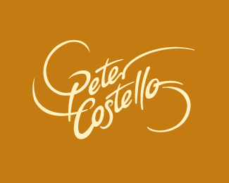
Description:
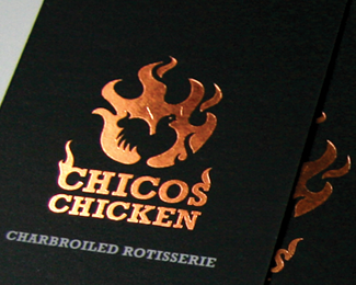
This is the second option for the client, but we both agreed that the other one reflected his business and personality better, I liked this one too though.
Status:
Unused proposal
Viewed:
18582
Tags:
beverage
•
food
Share:

Lets Discuss
nice one!
ReplyWow! that was fast, thank you Alex.
ReplyGreat work Rudy!!
Replyi really like this one more though. shame :(
ReplyThis is so great design! Excellent.
Replybeautiful
ReplyThank you all for your comments/votes, although I like this one as well, Peter is a chef (artist) that is very creative with food, he uses organic and local produce/meat, so, his creations are never the same, that is why we choose the other one, imperfections where fine in this case, this logo however was corporate for him and also you might find a 1000 logos similar to this.
Replynice swoooshes.
ReplyMuch appreciated Trevor, nice portfolio you have there.
ReplyThank you Jan, appreciate it.
ReplyAlen, Sean, Jerron, Vladimir thank you for your votes.**Christian, gracias por tu voto.
Replymuy buena forma and nice font
ReplyThanks for your comments Dennis.
ReplyThank you Alan, hope you are doing well.
ReplyI love it mate!
ReplyThanks again Mads, I love it too, unfortunately this option was not the final pick, the one in the first page of my showcase is the one that all of us collectively decided was more appropriate for him. Witch I love too BTW.
Replyincreible, la fluidez con que lo haces me encanta. De que parte eres paisano?
ReplyGracias David, tu trabajo como todos los paisas en este site como Oronoz, Lalo trabajan increible, me siento orgulloso por todos, yo soy de Le%F3n Gto., pero resido en Toronto desde hace muchos a%F1os. Saludos.
ReplyThanks Steven.
ReplyMuch appreciated Bojan and Niall, Slainte!
Replyhey no problem man, it's an excellent logo. It's also nice to see custom type
ReplyLove your Plus One logo. Thanks again.
ReplyMuch appreciated Nima, unfortunately this one wasn't chosen :(
ReplyThank you tiko1232 and Neil, much appreciated.
Replyabsolutely love it!
ReplyYou're so kind John with all the comments, I really appreciate them.
Replygreat
ReplyVery impressive! Great!
ReplyComplex symmetry meets perfection. I just keep coming back to this one and I totally love it, Rudy.
ReplyThank you all for your support!!
Replythis is stylish...
ReplyBharat, Stylish... It's a nice word, thank you for your point of view. :)
ReplyI faved and floated this a long time ago, just wanted to let you know how beautiful it is Rudy.
ReplyThanks for your nice words Joe and for returning to this one, really means a lot to me, the cheque is in the mail for your endorsement :)
ReplyAwesome lettering Rudy!
ReplyAlena and Michael, thank you for all your comments about this one, really appreciate it. Alena welcome to LP.
ReplySuper awesome... love the flow...
ReplyPlease login/signup to make a comment, registration is easy