Description:
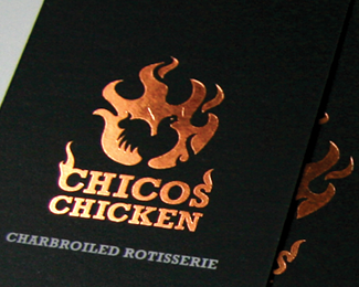
The first location is almost ready to the public, we used foil stamping for the cards, the delivery car is almost ready, and I love the texture on the wall, an artist made it following the texture we are using in all the branding system, it's all coming together, FINALLY! pheww! http://tinyurl.com/7nfckva
As seen on:
rudyhurtado.com
Status:
Client work
Viewed:
8332
Tags:
beverage
•
Food
•
Rudy
•
flames
Share:

Lets Discuss
impressive work Rudy, love how it looks:)
Replyit is fire catchy
Replyoh man ... I'm really jealous ... no german client will ever make something cool like this
ReplyThank you guys for your comments, it's being fun working with this client, everything I propose he wants to do it :)
Replyvery nice, it looks pretty cool on the card
ReplyThanks Jacob.
ReplyLooks amazing Rudy. You have a incredible knack at getting your clients to agree to spend that extra little cash to elevate the brand to the next level. Congrats.
ReplyBTW...Whereabouts in TO is it located?
@Phil Butler, thanks for your kind words man, I guess they realize that it's worth the extra :) the first one is in Markham, just outside T.O. are you in Ontario?
ReplyHey NP...just giving credit where credit is due:)
ReplyYes I'm in T.O. I'll have to head up the Markham and check it out once it opens and take a look at your handy work.
I'll let you know when it's open, and maybe we can meet up to try it. I would say mid June.
Replythese look great, rudy.
ReplyThank you so much Colin.
Reply@RUDY GREAT TEXTURE..VERY WELL EXECUTED..
ReplyGreat work
ReplyThank you @brandingbros and levogrin.
ReplySo nice man!
ReplyThank you so much Kevin @ocularink
ReplySounds like a plan Rudy.
ReplyVery cool! Excellent work and impressive implementation of the idea.
ReplyMerci @ Artgeko somuch, @wiking stay tuned! :)
ReplyPure gold Rudy!
ReplyNice one Rudy!
Replywow. sexy cards!
ReplyThank you so much Gert and Tabitha, means a lot!
ReplyPlease login/signup to make a comment, registration is easy