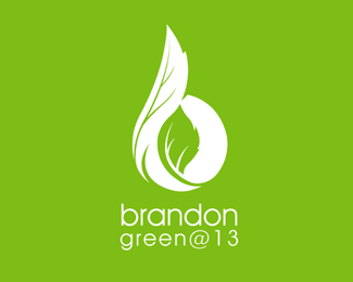
Description:
BarMitzvah brand identity for Brandon, check out brandonhs.com to see the invitation.
As seen on:
rudyhurtado.com
Status:
Client work
Viewed:
9449
Share:
Lets Discuss
really nice organic form you got going there.
ReplyThanks theartistt, people responded well to it.
ReplyThanks Cerise you are so kind.
ReplyThank you Mel.
ReplyWhat a beautiful mark!
ReplyThanks for your words Dave.
Replyvery slick! i like it : )
ReplyThank you very much Rich.
ReplyWonderful...well done
Replyvery interesting approach!
ReplyMuch appreciated Dario and Andreiu.
Replyi really like how you made the whole b a leafy shape. it's so easy to plop a leaf in a letter's negative space, but this is nicely done.
ReplyThanks for your comments Laura... in all of my logos, nice work in your showcase, I really like your sense of colour.
ReplyBrilliant Rudy! this oozes elegance!
ReplyNice!!
ReplyPlease login/signup to make a comment, registration is easy