Description:
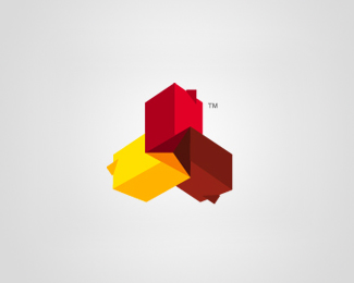
The logo-mark is based around the Tyrrell Knot a celtic symbol of three interlinking points - http://tinyurl.com/6kgtf7f - In this work the points have been replaced with houses and represent the business' three core services; design, construction and certification. The colours were chosen to move the brand away from the traditional greens and blues associated with the industry and give it a more playful, accessible and affordable appearance. The shapes and the red colour were inspired by monopoly houses and designed to give the brand an almost familiar feeling.
As seen on:
For the development process click HERE
Status:
Client work
Viewed:
14915
Share:

Lets Discuss
super style %3B)*and nice colour palette
ReplyThanks, glad you like.
Replywhat a great work!
Replynice
ReplyGREAT FORM!!!
ReplyQuite an amazing piece!
ReplyI think that unfortunately although logo's should be simple we may have add extra depth. I do think that this negative space trend is something that is new enough to allow designers to come up with some really original ideas. I really like it when I discover something about a brand I didn't see before. I love watching my friends reactions when I show them the Toblerone bear!
Replyooops wrong logo, too many tabs open!!
ReplyThis looks, how my head feels... Very cool! :)
ReplyThanks for the great comments!
ReplyBeautiful form and beautiful colour.*All together a fantastic piece.
ReplyGreat work!
ReplyLovely abstract knot Richard, love the design and the colours chosen.
ReplyThanks Gert!
Replywow this is so awesome! WOW
ReplyThanks action glad you like it.
ReplySolid logo
ReplyPlease login/signup to make a comment, registration is easy