Float
(Floaters:
32 )
Description:
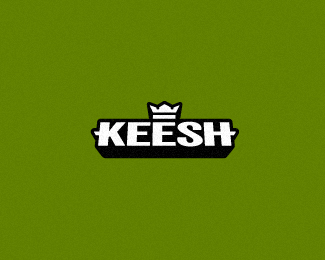
Fantasy clothing brand for the Home virtual environment.
Status:
Client work
Viewed:
4186
Share:
Lets Discuss
Should I make the black outline STRAIGHT or keep it with the little details around the 'S' and the 'K'?
Replyi think either way works, but the straight outline might look better, since you only have gaps on the S.
ReplyThanks Lecart, I was a bit stuck on this.
ReplyLike it mate, it's more balanced this way IMO!
Replythis is it. nice.
ReplyMissed this. Nice, Richard.
ReplyThanks for the comments, I really should have asked sooner, I would have sent this one to the client rather than the other with the cut details.
ReplyI saw the cut one on dribbble and i like them both but i prefer this one over the cut version. Either way great work!
ReplyReal men don't design keesh.
Reply%5E Ha!
Replysimply nice....:)
Replygr8 execution
ReplyPlease login/signup to make a comment, registration is easy