AKA - Final Proposal
by richardbaird • Uploaded: Nov. 17 '10 - Gallerized: Nov. '10

Float
(Floaters:
88 )
Description:
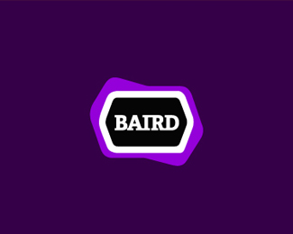
Bringing together a variety of artistic talents (The lines in the type represent the individual lines of a thumb print to represent identity). Big thanks to Type08 for help with direction. Hopefully this is the final iteration.
As seen on:
www.richardbaird.co.uk
Status:
Client work
Viewed:
20374
Share:


Lets Discuss
This is beautiful! I like this one better that all the other concepts. It's nice to see designers are helping each other! Cheers!
Replyyeah this one stepped up a bit. although I liked your others also. great design tips alen, and nice execution richard. looks great.
ReplyThanks I really appreciate the floats and all of your help Alen.
ReplyAwesome type!
ReplyWell deserved gallery spot. Congrats :)
Reply%5E%5E%5E%5E%5ECompletely agree with fanego.
Replywoaah, this is great!
ReplyThanks for all the nice comments.*
ReplyI like this, but I would like it even more with only flat colors.
Replygreat stuff
ReplyI would generally avoid gradients but on this project I was inspired by the colour transitions in watercolour paintings and thought it would tie in well. Of course there will be a solid colour and single colour version as part of the brand pack.
ReplyIt's been great watching the progression of this idea. Glad you landed a gallery spot with this one%3B it is well deserved. As for you final execution, it looks awesome. I love the curves, and there's a wonderful sense of movement going on. Those letterforms are super-sexy, and your usage of color really helps bring this alive. Flat color may have been nice, but I think your gradient usage is quite tasteful. Very well done.
ReplyWow Atomicvibe that's really nice of you, thanks! :)
ReplyWhat Fanego said. This came out really nice:)
Replyexcellent job ..
ReplyThat is a wonderful logo. But i just what to know what come up in you mind to do this work and also why did you choose to use this font for the work?. Thanks
ReplyLovely!
ReplyGreat work!
ReplyVery unusual and lovely..
Replygreat style and colors
ReplySexy logo.
Replyyou have a nice portfolio Richard! congrats
ReplyThanks m1sternoname thats really nice of you.
ReplyLovely colours indeed!
ReplyThanks Cresk and for all the floats.
ReplyPerfect ! Daring colors
ReplyGreat stuff, Richard!
Replygreat typo :) even I almost read %22CIKA%22 instead of %22AKA%22.....no offense just wanna say that.....love it anyway.
ReplyPlease login/signup to make a comment, registration is easy