Hoofd & Letters
by rensdekker • Uploaded: Jan. 03 '15

Float
(Floaters:
0 )
Description:
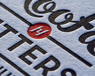
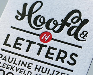
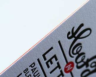
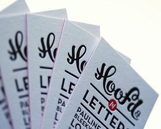
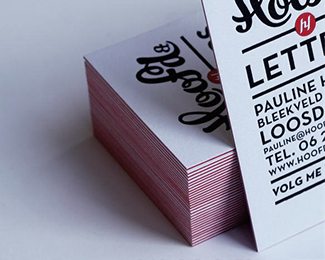
Hoofd&Letters is a Dutch marketing and communication company. Hoofd&Letters is Dutch for Head and Letters and symbolizes the balance between emotion and reason which was visualized by using hand-drawn typography together with a sans serif typeface. The business cards were designed as part of the typographic visual identity of Hoofd&Letters. We wanted the business card to be special, especially in these days with so many cheap web printers who all deliver the same mass product. We wanted to get back to the real craft of letterpress that gives that unique feeling of tailor made quality. The cards are made out of triplex laminated paper with a red core that symbolizes inner passion from the heart.
Used paper: Custom triplex mounted Colorplan paper by GF Smith, London
As seen on:
www.rensdekker.nl
Status:
Client work
Viewed:
1166
Tags:
typography
•
black
•
red
•
vintage
Share:

Lets Discuss
Please login/signup to make a comment, registration is easy