Float
(Floaters:
8 )
Description:
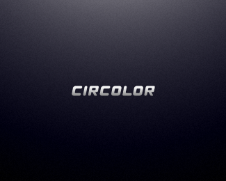
Typo for Circolor logo. Complete custom font.
Status:
Unused proposal
Viewed:
1897
Share:


Lets Discuss
CIRCOL OR. There's a kerning issue.
ReplyMilosz, it is more visual issue. Letter L create that empty space. All letters are correctly aligned.
Reply%5EI assume that you meen that there's the same spacing between all the letters when you say %22correctly aligned%22?
ReplyYeap.
Replyproper kerning isn't about making equal spaces between letters, it's just like you said pure visual issue and even more. just trust your eyes...if they say the space between L and O is too wide - tighten it a bit! without measuring. cheers!
ReplyAbsolutely. I just said as info that space between all the letters are same. Generally, L always need to be manually set kerning. Updated.
Replyimprovement is obvious!
ReplyPlease login/signup to make a comment, registration is easy