Description:
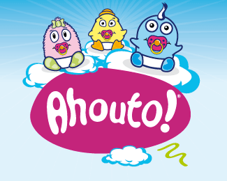
BACKGROUND: After a major renovation the popular apparel store required a strong visual presence in the market of kidswear and baby fashion and accessories. There was no existing brand image nor logo.
CHALLENGE: Competition was strong and a fresh idea with a contemporary execution was the moto of our work. The market was very thirsty for something new. Business in this field was very low since most customers preferred to buy clothes from other cities since there was no trust or quality in their city.
SOLUTION: A name was given to the store, �ahouto!� which is an interjection and means �ohh! How so cute!�. A very used word among mothers, grandmothers etc. This worked along with the name of the owner since the city is quite small and everyone seems to know each other. The cartoon style was used in order to create the logo and the accompanying characters which really have their own personality and baby look (their names are: blue=bebios, pink=katroulo, yellow=pepes). This decision derived from the competition. None of the major competitors ever used any original cartoon style marketing communication so it was an opportunity for us to do it first,
RESULT: Ahouto!�s visual identity has been applied on posters inside the store, print ads, T-shirts, stickers, bags and all sorts of things that a store like this will need. It has created great and very positive, cozy feelings to all customers who visit the store and especially the young ones that love those three figures.
Status:
Nothing set
Viewed:
2658
Share:


Lets Discuss
Please login/signup to make a comment, registration is easy