Description:
specialist cleaners...
As seen on:
castus
Status:
Client work
Viewed:
19532
Share:



Lets Discuss
i like it. but do you really need that soft shadow?
Replyhaha... no i dont really need it... just want it... call it nostalgia... but thanks
Replyno shadow :)
ReplyThat's nice, man :)
Replythanks eziemac...
Replynido style... perfect!
ReplyCute! I like the proportion of the mark to the type.
Replylooks great nido!
Replythanks guys... by the time I retire I hope to have created an Ark too! :)
ReplyI like what I see.
Replythanks jerron...
Replylike this, great work.
Replygood job!
Replyyes, love the whimsical style you have in your portfolio!
Replythanks for looking guys... whimsical is a state of mind...
Replyi really like it nido. better without that shadow for sure! :)
Replymaster of simplicity :)
ReplyClean Machine
ReplyPerfect, I love it. Nice work.
Replyexcellent concept and execution. Lovely job Nido.
Replynice work, nido!
ReplyCool, very stylish
Replylol @shanya ID pic
ReplyNice, like it a lot.
Replynice and clean. solid design.
ReplyThere seems to be overwhelming support here. Maybe I'm the lone gunman, but I don't get it. What is the symbol suppose to represent?
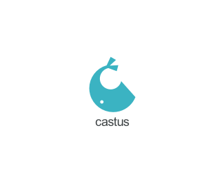
Replythanks everyone....**@Porter... the symbol is simply a stylized whale... shaped as a letter %22C%22... all the fuss for nothing huh.. i know! %3B)
Reply@nido, sorry man, while i usually like your work, i'm a little with porter here on this one. i didn't get the whale until you said your comment above. what's a whale have to do with specialist cleaners, btw?**
Replythey have a whale working for them...
Replyhrmm..sounds interesting..what kind of cleaning do they do? %3B)
ReplyHAHAHAHAHA!!!!!
ReplySaw the whale from a mile away. And I dig it.
ReplyNice, clean %26 simple, bravo!
Replythanks again folks...
ReplyIt reminds me of the bluewhale logo by Muggie Ramadani: http://behance.vo.llnwd.net/profiles/59128/projects/61735/591281203950467.jpg
ReplyPlain and simple...love it...
Replyplain and simple... yep... thats me :S
ReplyNice. Reminded me of Muggies bluewhale as well.
Reply%5Eyeah... me too.. now that ive seen it.. however.. i think my whale can beat that whale in an arm-wrestle... so im not too worried... yet...
Replygreat, great mark. placement of the eye makes this one stand apart.
ReplyYour whale has arms?
Replylol
Reply@Oc... yes.. it was originaly a walk on for spongebob..
ReplyI knew whales had calves...but arms?
Replyhaha...a bit of armless fun!!
Reply...and hands too. Just found this:**%22It was thought that once very long ago that whales had arms and legs. Today whales have adapted to life in water. A strong tail replaced the legs. The tail has two %22wings%22 or flukes that developed on the sides of the tail. Whales have flippers. If you could see inside the flipper you would find that it has five fingers and is surprisingly similar to the human hand.%22**So Nido's whale is a retro whale is all. Word.
Replyseeee... now bow...
Reply(bow)
ReplyThere's not much I wouldn't do to see a walking whale...or one that could arm wrestle.
ReplyCharisma!**I am phibian of your work!
ReplyIt looks like a fish
Replyyou are one natural born designer . it's not really related to this design particularily, but to most of what i have seen in your folio.big up !
ReplyWow Nido, this is really outstanding.
ReplyWell done.
ReplyThank you everyone.
Reply@rivington design house. Ah-ha! the old "like" for "like" huh... I like it ;)
Please login/signup to make a comment, registration is easy