Description:
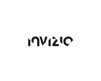
wip.. IT service provider that backs up your data.. invizio is a play on the word invisible...
Status:
Nothing set
Viewed:
13806
Share:




Lets Discuss
awesome dude
Replythanks roger!
ReplyCool. Did Predator inpire you?
ReplyHere's the missing s
Replythanks... %26 thanks for the s... Predator?
ReplyYeah Predator's jungle camouflage. Come on get with it.
Replylol!.. oh ok... actually this was kind of an accident... i have a version where all the bottoms of the letters were sliced in the same angle (like the n %26 the last i) when i started flipping them around to see what would happen i stumbled on this.. thought it looked kinda nice. %0D*%0D*i did have an encounter with the real 'predator' once.. he didnt last too long though!
Replyi dont know... i dont think so.. i did post some earlier designs that i withdrew.. but i dont recall it being done by anyone else..?
ReplyBrilliant as usual.
Replyka ra te ty po :)
Reply@moverdrive.. thanks!%0D*%0D*@datasky... i'll show you ka ra te! .. %3B)
ReplyWhat a smart logo. Really love your sharp vision Nido.
ReplyTo make it more instantly readable, perhaps back the slicing away from the corner of the %22Z%22 and not touching the counter of the %22O%22. The mind will have an easier time glancing at the word if none of the letters are split into two pieces.**This logo is startlingly creative using simple typography. Excellent work.
Replygreat logo !
ReplyThought immediately about PREDATOR as I read the description, very cool logo nido!
ReplyNice mark, but reminds me of Simplex ( http://www.nanourl.ro/kf400 )
Replyvery nice work, and it seems i have a similar project %22here%22:http://logopond.com/gallery/detail/65567 :))*all the best!*
ReplyWow, this visual effect is too memorable. Pretty props!
Replythanks people....**OMNI... nice to see you back... hope you'll be showcasing some more of your inspirational stuff mate...
ReplyPlease login/signup to make a comment, registration is easy