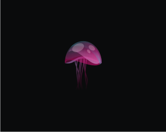
Description:
wip... will most likely not go down this route... but nonetheless...
As seen on:
wip
Status:
Nothing set
Viewed:
4090
Share:


Lets Discuss
beutiful...
Replysuperfast, superfast. this is neato.
Replylovely colors.
ReplyWow.. gorgeous!
ReplyNEETO
Replythanks fellas... wish it was a go now :)
Replyhaha.. thanks Justin...
Replymagic jellyfish
Replycheers epsilon... thanks for looking...
ReplyYou can look but you can't touch.
Replyunless of course you are this %22dude%22:http://www.roumazeilles.net/news/en/wordpress/wp-content/uploads/2007/10/giant_jelly_fish.jpg %3C%3Cclick
ReplyLike it. *That dude has some nerve... and something else too... :)).
Reply%5Elol... hell yeah... ain it intriguing what might exist way down in the sea... and yet we're all too busy looking for aliens in outer space.. I read somewhere we (scientists) know more about space then we knew about our own planet (mainly the sea)... thats so frustrating man!
Replywell I see his wanger in the pic. Not sure about his HUEVOS
Reply%5ELOL!!!.. what made you look there!!!.. when I said way down I didnt mean that %22way down%22... dude thats so funny though...
Replyit was glowing.
Replylmfao.. no wonder even the giant jellyfish is trying to get away!
ReplyHE funny stuff, thanks for the laughs. My stomach hurts.
Replyi m 100%25 sure if sum newcomer has designed it then i think these comments looks a bit different.. no problem with anyone just wanna say sum times it shows the worth of being big fish on pond..
Replymarkmen... would you reconsider that to being maybe 60%25 sure?... my last three logos upload got zero comments... it really is not %22who%22.. but %22what%22
ReplyNice one big fish!**Yeah it is a bit patronising from markmen. Yet another swipe at nido from a 'no logo' member. Your fan club is growing mate. *
ReplyI'm with you markmen, nido's getting these comments because he is a new comer, otherwise, no way man, the big jellyfish get all the props on the pond**also, don't think it would work on a DVD spine, it might paralyze it
Replyjust for ur knowledge pals.. i had few logos earlier but i removed them due to sumreasons.. so dont try to shift attention sumwhere else..u can chk my joining date as well.. i had valid point i just dont wanna say directly i dont like this logo ( its really not looking like nido,s work).. nido is great guy n designer having great logos in his belt.. why u all take it in sumother way.. appologies to nido he feel hurt..
ReplyNot to stand up for Nido as he can do it himself, have to admit im struggling to find validation in any of your rationale since the mark is quite unique ... and your point seems to be on the princely comments the logomark has got ... your not actually insulting the mark or Nido but the designers who actually like the work ... so even if not up your alley or lane .... your point is not actually valid .... nice work Nido
Reply%5E dude.. i ain hurt.. ok.. maybe a little.. after all you did refer to me as a %22big fish%22... but im over that now... **but looking back over the comments here.. maybe 4 or 5 are like really nice and about the work.. the rest is kinda just shooting sh!t.. (mainly with logomotive) ...hey, is that what you meant though?.. we dont get enough %22random%22 back %26 forth on logopond with new comers?... is it?
Reply@nido- no dont wanna hurt u i simply want to bring attention to the point wat i feel on pond some works of great designers get what that they dont worth.. i really cant believe this one is done by nido as i am regular on pond since last 3 year..*@kaimere- i think there is no harm telling designer a personal thought that i dont like this one may b other r liking it.. Now really i think pond now needs a personal message options.. to dont hurt others feeling..
Reply@marksmen your personal thoughts should really be kept to yourself since it doesnt really come across as professional to say the least especially when your attacking the comments rather than having said anything neg. or positive about the logo. As for the pond having big fishes sounds like you have a chip - sometimes quality just shines through no matter who you are ... and some of us just appreciate it ...
Replypretty nice nido :)**Apparently the best way to cure a jellyfish sting is to get someone to urinate directly onto the wound, I wonder if the same works for incredulous parasites?
Replyleave d matter i think, my comment came after long patience so it might look harsh but that is reality after all..
ReplyNido or no Nido, this is still great!
Reply%22for the pond having big fishes sounds like you have a chip - sometimes quality just shines through no matter who you are ... and some of us just appreciate it ...%22**I love fish and chips.
ReplyI have to agree amongst the others, if work is great whoever you are, speaking for myself I'm always appreciating it, and as someone said, even well known people here as you called them %22big fishes%22 are not getting many feedback on some works. This jellyfish has beautiful colors, very good approach on shading, and for me it looks like Nido's work, look at Colibry for example.
ReplyI'm with milou- it's superfast.
Reply%5EGood call on Colibry...I can see Nido's %22trademarks%22 in this, the almost Super Mario Bros. mushroom (shape %26 spots) was a dead give away.**As for having a 'style'...if you've got one and/or can market one great, but it is important to remember that the client's personality/humour/nuance also needs to shine through along with it. I think that fact gets lost on some people when they see something from someone that is %22a little different%22.**Just something that's been on my mind.
Reply%22it is important to remember that the client's personality/humour/nuance also needs to shine through along with it.%22**agreed... emphasis on %22along with it%22... a lot of the clients that contact me do so cause they say they like my %22style%22... I personally cant quite put my finger on what my %22style%22 is but nonetheless do make a huge effort to impose my personality on the client in the initial stages... this in turn puts us both at ease, they know a bit more about me %26 feel they can share a bit more about themselves, it also develops trust and allows me the creative freedom that I require... **in the end its not so much about style as it is about trust...
Reply%22in the end its not so much about style as it is about trust...%22 ding! ding! ding! ding!
Replyyour gradient / transparency work in the last while has been exceptional, regardless of this logo's application, I appreciate the form over function any day on this. ** %09*je suis je reste - (superb according to Del boy trotter)
Reply%5E My thoughts exactly Kev :) **Which is why the above 'it's different, therefore it's bad' comment towards the beginning really erked me...Someone focusing on the 'how' instead of the 'why' or, more so: judging completley on the 'how', disregarding the 'why' then claiming contridictory comments were due to the 'who'...tends to bug me.**I think it's great when clients seek out a particular designer based on their (here comes that word again) 'style' as you said it shows trust, but I think it also shows that from the very start there's a sense of seeing eye-to-eye, which is why I think the output of these situations is always well received.**Not to mention it's far more humbling than %22I really like your logo Candysource, was it done for a client, or is it for sale? I couldn't find it anywhere on Brandstack%22.
Reply%5E AMEN! but you lost me with some of the hows and whys :)
ReplyGREAT!!
Replyand why aren't you going this route! this is such an amazing piece of work!
Reply@thisGuy What an incredibly cringeworthy comment.
Reply@thisGuy Surely it's David's job to police this site not yours? We all have something to offer in terms of constructive criticism and have a right to contribute where and when we see fit. Granted, on occasion things get out of hand when a provocative comment is made. Peace.
Reply%22I think it's great when clients seek out a particular designer based on their (here comes that word again) 'style' as you said it shows trust...%22 I gotta disagree with you, bud...hope you won't take offense. I was thinking kind of the opposite. I was emailing nido yesterday and telling him how too many client's opt for a logo designer simply based on their specific style. To me, that's exactly the opposite of trust. Rather than go to a designer who shows no set style and trust that the designer will create a logo that is appropriate for the company, they go for a designer that has a specific style so they kind of already know what they're going to get. In my opinion, nido doesn't have a style. Neither do many of the other big players on this site. Which is a great thing! The client's that can go to one of those designers that show a full range of style in their portfolio says trust to me. :-)
Reply%5EWell said Kev, I like your style %3B)
Reply%5ENice words Kevin.
ReplyKev also said I was gay... dont forget that...
Reply%22As far as me jumping in Nido can handle his own business, and really doesn't need anyone jumping in and standing up for him, or he'd email me about some comments.%22 Um yes I'm well aware of that. LOL!
ReplyNo offense taken Kev, good points :)
Replyi hear a sound effect when I see this logo**like a 'whloomp' sound**it sounds better then those silly voices
Replythe execution here is amazing!
Reply%5Ethat's what Louis XVI said!...
Replycan a headless jellyfish still navigate undersea
Replyuhm... why isn't this in the gallery i ask? :-/
Replywops... mark only, doh %3E.%3C
Reply@raja.. no.. only on dry land...**@S.vanElderen... yeah... not without text...
Reply...if at all I should add.
Replyso amazing, illustrator?? nice!
Reply%5ENope, it's a jellyfish.
Replythat is amazing.....nice, Love it :)
ReplyGreat jelly, nido!
ReplyPlease login/signup to make a comment, registration is easy