Float
(Floaters:
3 )
Description:
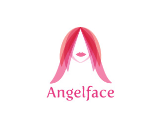
Angelface designed an A out of wings
Status:
Unused proposal
Viewed:
5396
Share:





Lets Discuss
I love this... maybe the colours are to agresive in this case but it looks damn good!
ReplyPhane, Thanks for the comment and the float. Softening the colors will allow more of the transparency to show through. good idea
ReplyLove this font (what is it?). Cool design too but something about the pointy head is buggin me. I know that makes the A but... maybe if there were just a bit more compound curve at the top and the bottom was less wide. Just a thought.
ReplyLogoboom, Thank you for your valuable comments. That's exactly what she needed! I think by keeping the shape of her hair parted to a perfect point on the inside insured the integrity of the A but allowed me to round out the top of her head making her look human. The font is Fertigo.*You are dabomb and your comments are spot on!
ReplyPlease login/signup to make a comment, registration is easy